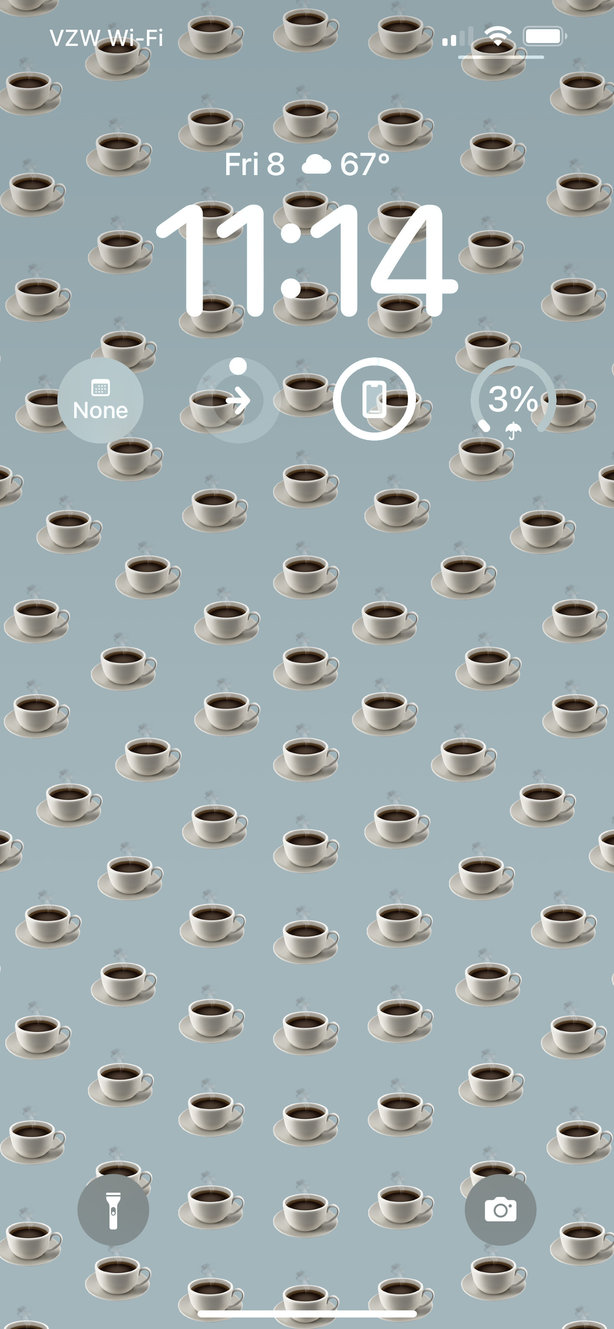
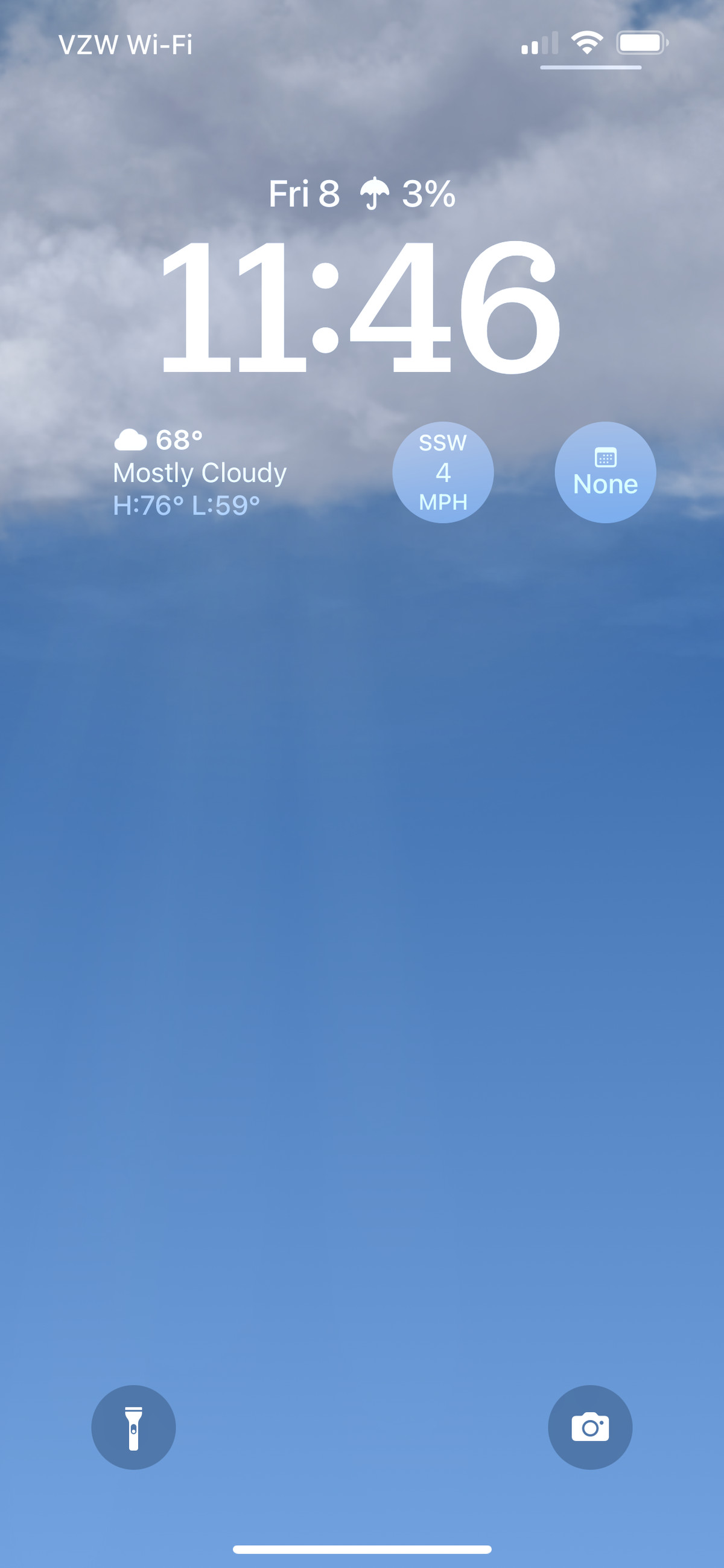
There’s a tendency among the highly tech-literate (you know, us nerds) to approach new features with a jaded, seen-it-all-before sentiment. That’s especially true when Apple announces new iPhone features with lots of fanfare and self-congratulation. The Android faithful will then point out that this groundbreaking achievement existed on a Nexus phone seven years ago, and the first three versions of it sucked, but it’s great now.
That attitude could certainly be applied to one of the centerpieces of iOS 16: new lock screens. On a high level, this update adds more customizability to the lock screen, with more wallpaper options and the ability to add widgets. Not groundbreaking stuff, considering that Android 12 lets you easily customize your entire UI to match your wallpaper, right down to the app icon colors. But as I’ve used the developer beta over the past few weeks, the new lock screen has impressed me more than I imagined it would. It’s a simple update, but it’s one that will probably be noticed and adopted widely by iPhone users — nerds or otherwise.
There’s just a lot more you can do with your lock screen in iOS 16. Previously, you could change your wallpaper and… actually, that’s it. That’s all you could do. In iOS 16, there are more wallpaper types — like grids of emoji and real-time weather animations — along with different clock fonts and customizable typeface colors. You can add widgets to get more information at a glance, like when your next meeting starts or the chance of rain that day (vital information here in Seattle).


Apple has made some subtle tweaks to the lock screen to let your wallpaper take center stage. Like the Portraits watch face introduced in WatchOS 8, in certain pictures, the clock can partially float behind a human or animal subject. It’s a subtle but meaningful change — nothing spoils a cute kid photo lock screen like having the time stamped right in the middle of their forehead. Notifications have also relocated to give photos more breathing room. Instead of piling up across the middle of the screen and obscuring your wallpaper, they now appear at the bottom of the screen.
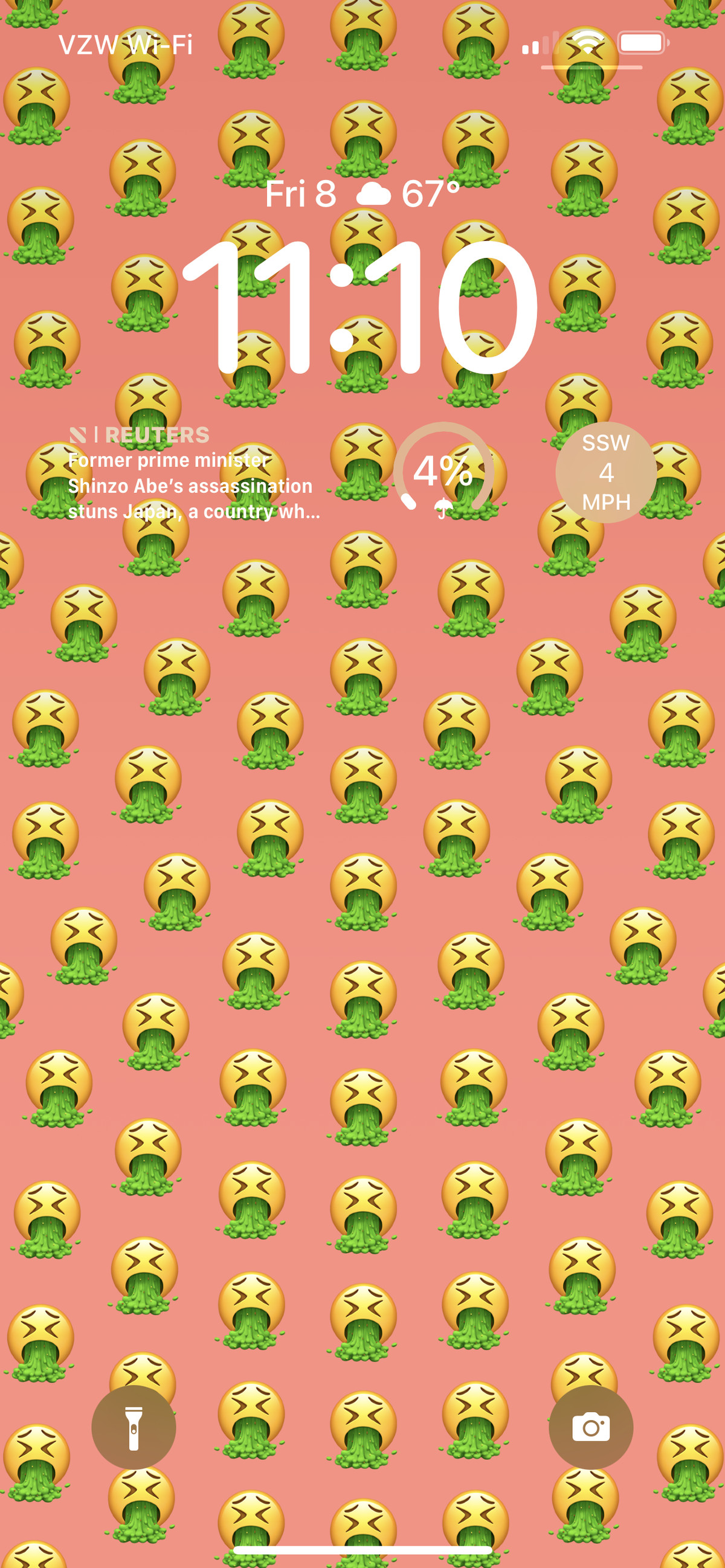
sometimes a pink wallpaper with a grid of barfing emoji is the best way to self-soothe
You can now have multiple lock screens — and there’s no need to dive into a settings menu to change them. That seems like a simple thing, but it fundamentally changes how you think of your lock screen. Being able to have more than one removes the pressure of picking out a single wallpaper or photo that you’ll see at all times of day in all kinds of situations. You can have a lock screen for the weekend, one for a particular mood, for a holiday, or whatever moment you like. It’s simple to flip between your collection of lock screens when the mood strikes, but if you link lock screens to focus modes, they’ll switch automatically when that focus mode starts.
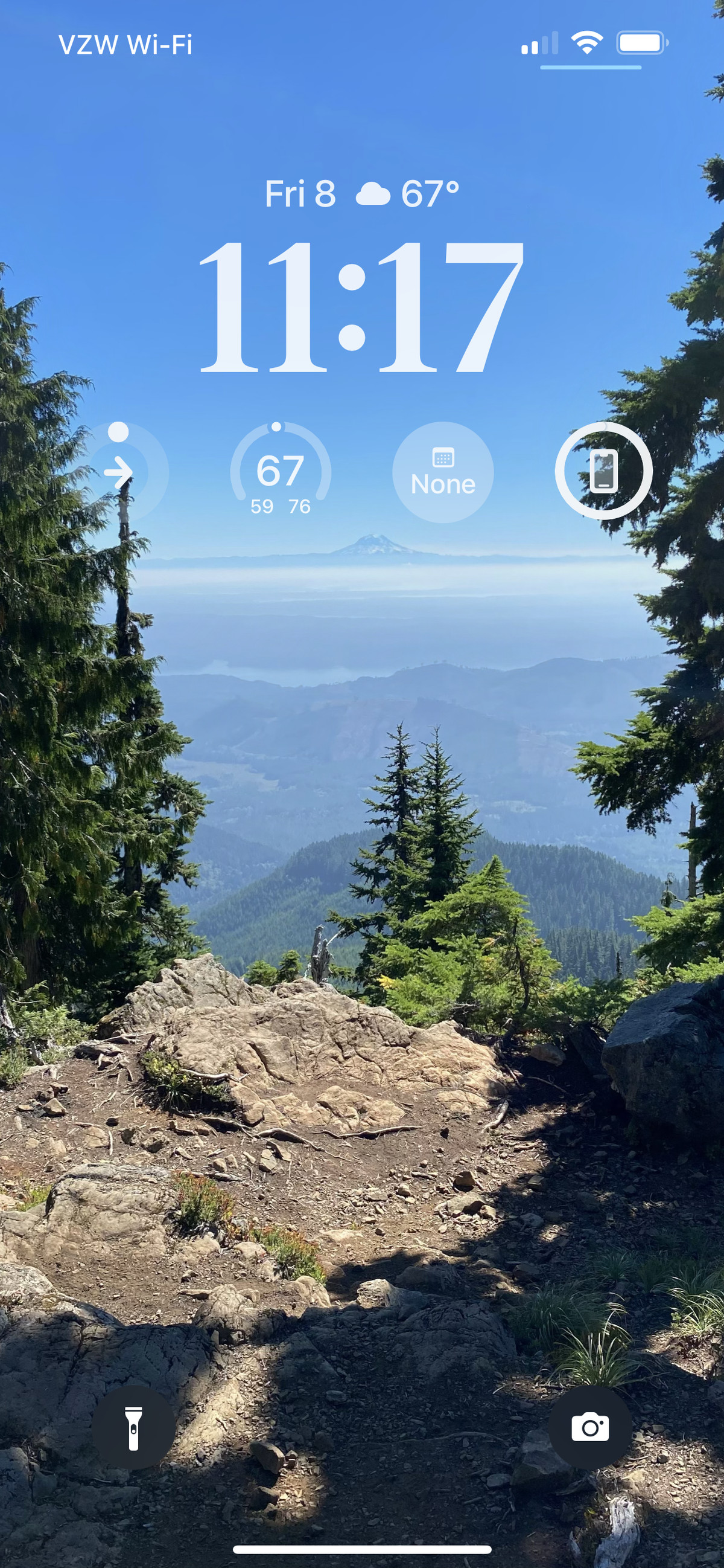
Case in point: sometimes a pink wallpaper with a grid of barfing emoji is the best way to self-soothe when, I don’t know, the Supreme Court decides to strip away your bodily autonomy. It didn’t restore any of my basic rights, but it made me feel better for a half-second every time I looked at it. And when I’d gotten all the mileage I could out of that lock screen, it was easy to flip back to one of my usual “Mount Rainier framed by trees” photos that people in the Northwest are required by law to take.


The most interesting thing about new lock screens is the very un-Apple-ness of it all. This is a company that likes to maintain rigid control over the appearance of its products; you might be the homeowner of your iPhone, but Apple is the HOA, and it runs a very tight ship. Previously, the best you could do to make your place a little homier was to put a wreath on the door. With iOS 16, it’s open season on festive decorations.
Of course, Apple isn’t letting you go too far — there will be no pink flamingo lawn ornaments in this neighborhood. You’re limited to eight font options, and they all have a particular on-trend look about them — no Comic Sans knockoff in sight. There’s also very little space allotted to widgets — the most you can cram into the “shelf” below the clock is four. It keeps things simple for the person using the phone, but it also keeps a little bit of control over how cluttered your lock screen can look.
Setting a new, self-styled wallpaper is kind of like putting on a fancy new pair of socks
Even within Apple’s boundaries, I’ve found plenty of material to play with. Some of its auto-generated photo suggestions have worked really well — it seems to prefer landscapes and pictures of people or pets, though it overestimates how much I want to look at my (very rude) cat throughout the day. They’re not all winners, but a few hiking photos I’d forgotten about have made for surprisingly good wallpapers. I’ve spent longer than I’d like to admit trying to assemble a wallpaper with just the right combination of funny emoji or finding the right accent color for a photo of said cat glaring from on top of the couch.
There’s also a certain visibility to the lock screen that elevates its importance. It’s the part of the device’s interface that someone else is likely to catch a glimpse of while I glance at the time or use Face ID. Setting a new, self-styled wallpaper is kind of like putting on a fancy new pair of socks: it’s partly for my own amusement, but there’s also a chance someone else will see it and be appropriately impressed/amused/mystified by my choices. It’s part function, part fashion, and part fun. Even the most jaded among us can appreciate that combination.