Less an overhaul and more refining what's already in place, iOS 16 is all about personalization on top of a retained solid foundation.
Apple's annual update of iOS has arrived, and as part of it, a large number of improvements to reinvigorate the iPhone's operating system.
Some years, this can take the form of sweeping changes that overhauls the entire experience. In other years, there's not a massive groundbreaking feature to center on, but many other quality of life improvements.
For 2022, iOS 16 broadly fits into this latter camp.
Sure, some much-needed visual changes could wow those who desperately needed them, and many different feature changes. But at its most basic, and is typical for Apple, iOS 16 starts from where iOS 15 left off and builds on top of that foundation.
With iOS 15 being a solid bedrock, the improvements started from an already great place.
The Lock Screen personalization push
Apple's main marketing message for iOS is "Personalization is Powerful." Make the iPhone your own with more ways to customize it exactly how you want.
To a point, that's true, but there have already been a lot of personalization options on offer. Users are pretty familiar with setting their Lock Screen and home screen to images of their choice, and icon customization and desktop widgets have been a thing for a few years.
For iOS 16, Apple's main bit of visual creativity involves the Lock Screen, the thing that anyone turning on the iPhone will see. This is probably the most significant bit of personalization anyone will see on the user's iPhone over the long term, short of applying cases to the device.
Sure, you could add wallpaper of a pet cat, so you see it whenever you turn the phone on, but this time, Mr. Meowingtons will be more of a focus than usual.
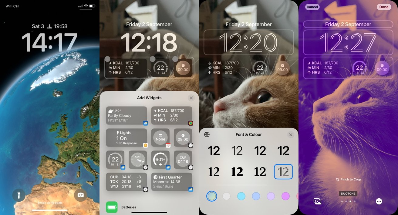
Apple's signature Lock Screen improvement is a new multilayered effect, which uses the photograph editing smarts of machine learning to isolate the image's subject. This allows for some interesting effects, but chiefly the ability of some elements of the Lock Screen interface to slip in behind the wallpaper's subject.
It's a subtle but fantastic effect to give the illusion of depth for a somewhat trivial bit of the interface. While it can be finicky, such as being able only to hide the edges of the clock before iOS deems it too much coverage and sticks the clock completely on top, it's still a lovely finessing of an image's subject.
The way the Lock Screen has been laid out has also been tweaked, with notifications gathering at the bottom of the screen. All to minimize covering up the subject of the wallpaper.
Further enhancements can be made, such as changing the font and color of the clock. You can also apply various effects to the wallpaper for a quick facelift, with some Portrait Mode-style options also appearing for some subject types and images.
More critical to the Lock Screen is the inclusion of widgets.
Providing essential data points for various subjects like the weather or Apple Watch goals, the widgets appear on the Lock Screen to give you a heads up without needing to fully unlock the iPhone to properly check.
This may seem like a duplication of being able to add widgets to the main home screen pages, but it is designed to work differently. Think of the glanceable nature of the complications you see on the Apple Watch, which are meant to give you just enough information but not too much.
To further promote this customizability of the Lock Screen, you now don't have to head to the Settings app to change anything. A long press of the Lock Screen will show all of the created and saved Lock Screens for you to quickly switch between, along with buttons to customize a selection or to create a brand new composition.
You can also set up the main home screen background to match the Lock Screen using a few effects, including blurring the image being used or a solid color or gradient based on what appears in the photograph. This is a nice touch, and it even applies when you change which Lock Screen background you use.
Apple's changes here aren't limitless, but it does give an extra avenue for personalization that wasn't there before.
A refocus of Focus
Along with giving more customization for the front page of the iPhone, iOS 16 also attempts to get more people up and running with another feature: Focus.
Added in iOS 15, Focus provided a way for users to go beyond setting up Do Not Disturb by giving users ways to manage how their iPhone responds to app notifications, messages, and calls. In iOS 16, Focus goes beyond minimizing annoyance and instead enables users to set how their iPhone functions in a specific focus mode.
At its most basic, setting up a focus lets you dictate who can trigger notifications that you can see and which apps can do the same thing. However, you can also set a focus mode to display a specific Lock Screen, Home Screen, or even a Safari tab group of most-used sites.
In effect, your phone could go from a Personal mode with entertainment and relaxation apps with work-related apps minimized. Conversely, a Work focus could allow calls from colleagues and clients, along with notifications from Slack and other productivity tools, while similarly burying notifications from distracting family members.
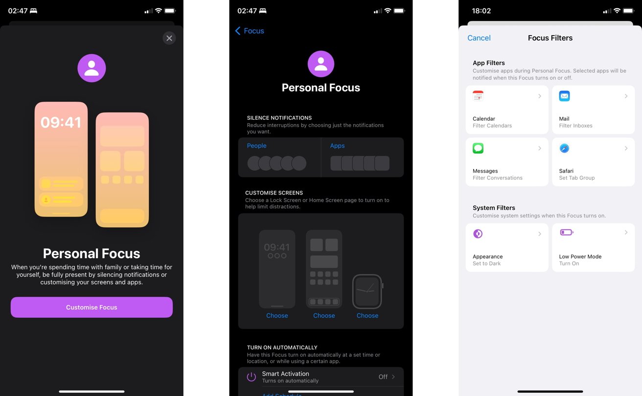
This separation of duties and what is available can be beneficial, as work minimally intrudes on home life and vice versa. Users may discover that they don't check their work messages as much when at the dinner table, simply because those messages don't appear onscreen as much.
Enabling specific modes also plays into the customization aspects of iOS 16, including selecting a custom Lock Screen and Home Screen layout for the focus and even extending to the Apple Watch.
If you're smart enough, you can set up things like Shortcut automations that kick in when specific focus modes are activated. For example, you could trigger an entire Homekit routine to play through, dimming lights and shutting blinds as you prepare for bed.
Going one step more, Focus Filters are a more granular way of temporarily hiding information from the user at specific times. Instead of just preventing an app from being visible, Focus Filters can allow an app to be shown but hide content that the user doesn't want to see in that particular mode.
This could be useful for Mail, as a user may want to see only task-related messages in the Work focus mode but only family messages in Personal. Likewise, they may not want to see themselves booked in for Aunt Agatha's Thursday Pot Roast while looking through Calendar for work purposes.
This seems like a neat way of solving seeing focus-specific content without blocking access to an entire app. However, it may be some time before other communication apps decide to play ball with the feature.
Photos changes and smarts
Part of Apple's changes to customization also tips the hat regarding the various image-related features of iOS, many of which can be found within the Photos app.
That tech for separating the subject from an image on the Lock Screen is also available in Photos. A tap and hold of an image will tell iOS to cut out what it thinks the subject is from a picture, and allows you to copy it to the clipboard.
From there, you could add it to an iMessage conversation as an attempt at a meme or paste it into other images and documents. Apple refers to this as "lifting."
Admittedly, it's not entirely foolproof but does a decent job of getting the point across for most people. For example, it may not necessarily pick up on wispy hairs of a beard, but it could remove the background visible through a subject's glasses.

Photos offer a fair bit more than this, with the big thing being iCloud Shared Photo Library. Unfortunately, it's not available at launch, but it does show a lot of promise.
As the name suggests, it is a shared library of images that multiple people can access within a family group.
The idea is that a family could easily pool images they've taken for group archives, such as commemorating gatherings and events from different viewpoints.
Of course, Apple has done it in a way that makes it both extraordinarily compelling and privacy-centric. Participants can share whatever images they want to the library, including setting it based on dates, photo subjects, smart suggestions, and even only sharing when other library members are nearby.
Images sync along with keywords and captions, with everyone having the same level of permissions to add, edit, and remove photos from the library.
You may get pressed by the rest of the family to take part, but you're still able to control what images are shared and potentially get rid of anything that could be potentially embarrassing or used in the wrong way.
For more regular use, Photos also has new features for normal unshared usage. For example, it can put multiple images that seem the same into a Duplicates folder, so you can delete unwanted extras to save space or merge them into a single picture.
If you're also editing a bunch of images from a vacation, you could save time by copying and pasting edits made to one image to a series of them. This is already possible with third-party image editing tools, so it's a welcome addition to Photos.
Live Text, Apple's feature that can pick out letters in an image and allows it to be selectable and then copied or translated, is also available for video. Pause a video, and you can select visible text for a variety of purposes.
This was previously very helpful with photographs since you could copy text as a form of OCR from a document, or you could quickly get the phone number from a sign, for example. The same on-device processing can do this for video, opening up more doors for picking up snippets of information.
The Family, continued
As well as introducing the iCloud Shared Photo Library, Apple's Family Sharing system now makes it much easier for parental users to get up and running with devices for younger family members.
Under the family settings, administrators now have an improved workflow for onboarding a child into the Apple ecosystem. This includes guidance on what content they could access in varying degrees, changing settings for location sharing, and other parental controls.
Yes, it is now possible for a child to use Messages to nag their parent for more Screen Time. It's also just as easy and quick to deny them the privilege.
These changes aren't just limited to setting up or managing the account but also getting new hardware running. A Quick Start feature will help set up an iPhone or iPad to work with the child's Family Sharing account, complete with any parental controls already applied to the account.
To help make it even easier for parents to keep control, Apple has added a Family Checklist to the system, giving administrators a nudge to periodically check the controls over time. Little Timmy won't be so little over time, and the checklist hints at ways their account can be managed to match their age and maturity level.
In a world where a small child can perform device tech support on an adult's behalf, the checklist will hopefully help parents do the actual device parenting, instead of outsourcing it to those it's meant to protect.
Communications updates
As part of Apple's updates to Messages, there are two general areas of improvement: Sharing and Editing.
Under sharing, SharePlay via Messages enables synchronized activities to be viewed by multiple people simultaneously, all conducted through Messages. At the minimum, this could allow users to chat with each other as they group-watch a TV show or film or even inspire remote group workout routines to keep everyone fit.
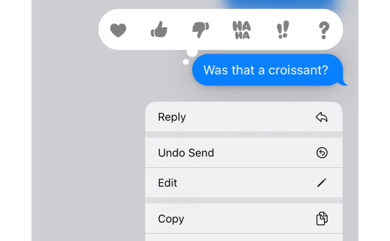
The more exciting element is editing, as users will be able to make changes to a message after they've sent it. Apple's implementation of up to five edits within 15 minutes of sending the message and allowing recipients to see a record of revisions will hopefully keep the feature for mistake-correcting purposes rather than anything sinister.
For messages that may be more regretful for senders, they can unsend a message up to two minutes after sending it. This is a more extreme option, one that will be very useful for messages sent in the heat of the moment that you didn't really want to send after all.
Even after deleting a message, it will not be completely gone. You could always recover it up to 30 days later if you have a second change of heart.
The communications updates are also present in Mail, which adds in things like smart search corrections and smart search suggestions. This sounds like the same thing, but one is more autocorrect of search terms while the other provides a better view of shared content in messages when you actually search.
These smarts also flow into creating messages, as Mail can remind you if you've failed to attach a document to an email or if you failed to add an intended recipient to the message.
Then there's sending emails, such as being able to schedule an email to be sent at a specific time. Like Messages, you can also unsend an email, but you have just a ten-second gap, and it can't have reached the recipient's inbox, otherwise, it will count as being sent.
You can push emails up the mailbox if you intend to follow up at a later time. Mail will also remind you if you opened an email but didn't get back to sending a response, with messages able to be resurfaced later on at a more appropriate time.
For both Mail and Messages, being able to delete or unsend a message will probably be the most welcomed by users. Regretful communications should be avoided at the point before being sent, but Apple's features are close to the next best thing.
FaceTime has its fair share of updates, too, including the ability to collaborate with other call participants on a document, like Numbers or Pages. This sort of collaboration feature will be beneficial in a hybrid work environment, or for families, for parents to help children with their homework.
While SharePlay is nice, it's easier to know what apps support it, and FaceTime will tell you what works with it. This would usually be an intuitive feature and "just work" for essential items, but we all know this will help some people who won't pick up on it through usage.
Finally, there's FaceTime Handoff, where you can seamlessly transfer a call between an iPhone, an iPad, or a Mac. You don't need to fumble around to try and get the call going elsewhere anymore, as it can transfer quite neatly to your required device.
So neatly, if you're wearing a Bluetooth headset for the call, that accessory will switch to connect to the new device and continue the call with minimal interruption.
Safety and Security
Continuing Apple's attempts to keep its users safe, iOS 16 brings with it Passkeys. Sure, password security is essential, but Passkeys are a next-generation attempt at the concept.
In short, think of it as similar to using Face ID or Touch ID to log into an app or website. Instead of automatically filling in credential information like a password, a passkey on the iPhone acts akin to a hardware security key to authenticate the device.
Apple announced Passkeys at WWDC 2022, and they will certainly be a secure way for users to sign into things. Especially since there will be very little change on their part when it comes to authentication itself.
All of the key buzzwords are there, including the use of end-to-end encryption, as well as synchronization across multiple devices using the iCloud Keychain, effectively cutting out the chance of being phished for that information. But to users, it's a face or fingerprint scan as usual.
Speaking of which, Face ID now works in landscape orientation for select iPhone models. It may not seem like much, but it will be a welcome change for anyone who unlocks their iPhone first thing after waking up but doesn't want to pick it up from a desk or wireless charger where it was set to watch videos late into the night.
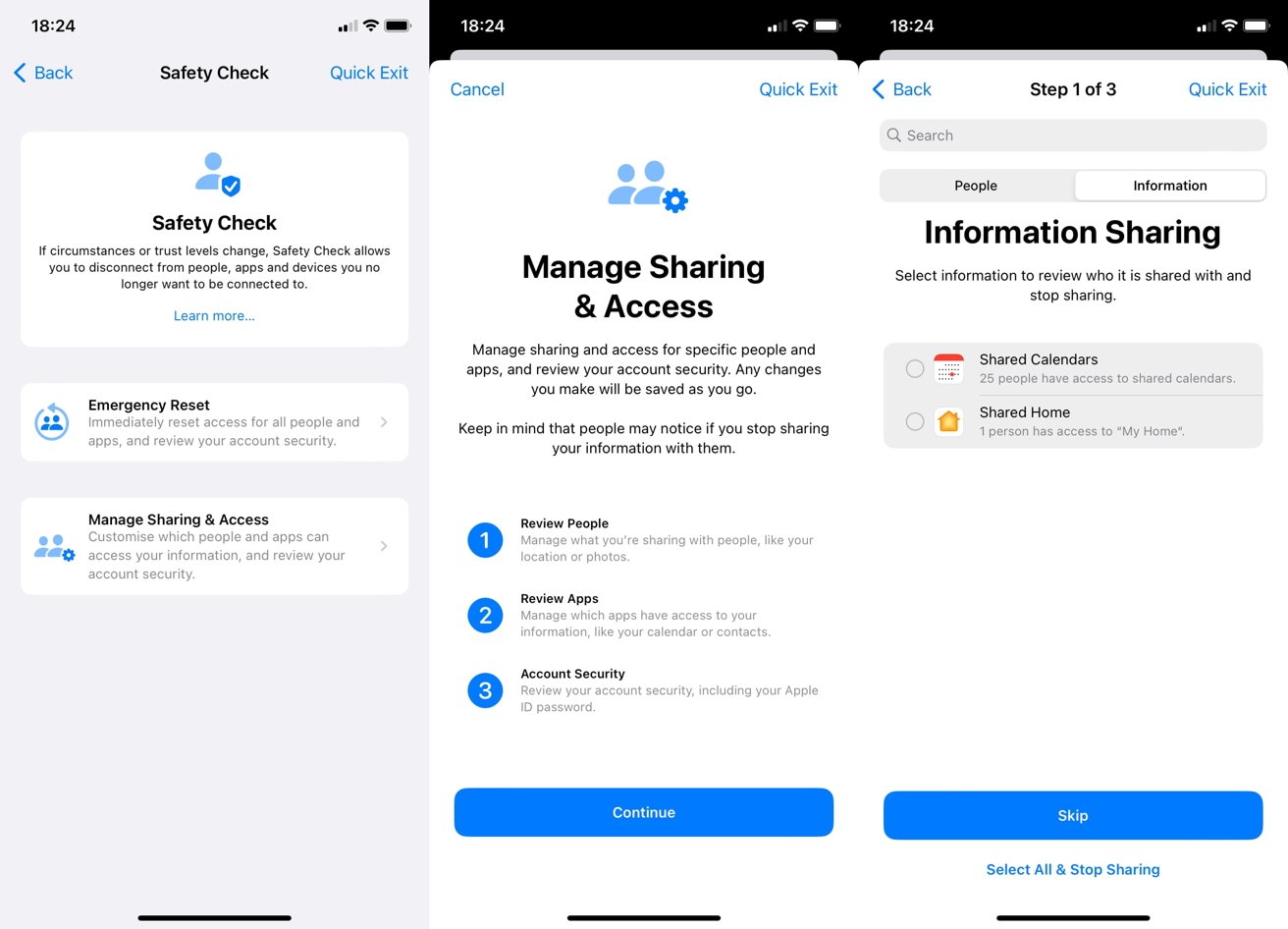
What will probably be one of the most underappreciated security changes will be the inclusion of Safety Check. Aimed at helping those stuck in abusive situations, Safety Check provides a way to minimize the control that another may have on them.
Safety Check can quickly pull all privacy permissions, sign out the user's account from iCloud on all devices, and restrict inbound and outbound messaging to a single iPhone or iPad. At the same time, it also disables location tracking permissions that may have been provided to others, such as via the Find My app.
In one security feature, a victim of abuse can stop their abuser from pretending to be them on their account or reading their communications by physically accessing another logged-in device and to prevent their knowledge of the victim seeking in-person assistance.
This is a massive improvement that can help put an end to domestic violence, and something that Apple should be commended for providing to its users. It's something that certainly could've arrived earlier, but late is better than never at all.
Safari Tab Groups and refinements
Safari, probably the most essential app in iOS, gets a few changes to make it more useful, with the headline feature being to do with Tab Groups. They now have dedicated start pages, which you can customize by adding a background image and pin tabs within each group.
This makes an organizational feature of Safari more structured to how you need it to operate.
Sharing the Tab Group set with others can also be just as valuable, since everyone could feasibly have the same sources and tools to work from. Shared groups can also update immediately, so everyone benefits from that one highly-organized team member.
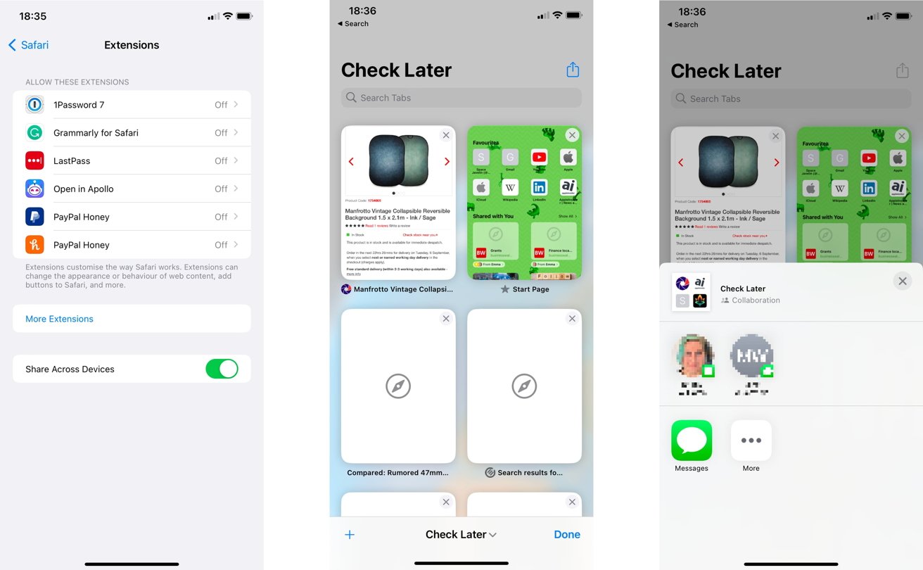
Lesser improvements include some password changes, such as editing passwords to be stronger and adjusting to the specific requirements of sites. Developers benefit from new web extension APIs, while extension syncing will mean users can see their extensions work properly across multiple devices.
The syncing isn't just limited to extensions, as website settings will also sync. This includes things like whether you've zoomed into a page or if you're using Reader view, so those working across multiple Apple ecosystem devices will more easily carry on from where they left off.
Apple Pay Later and Wallet upgrades
For users in the United States, Apple Pay continues to evolve what Wallet can do. For iOS 16, the primary attention will be on Apple Pay Later.
In an installment plan, users checking out with Apple Pay can split the payment into four chunks, paid over six weeks, without interest or fees. All this is managed through the Wallet, which will show when the next payment is due, and how much it will cost.
Arguably, Apple Card already offers this sort of feature to users, but Apple Pay Later is a more stripped-down version that doesn't include all the tempting extra benefits of credit card ownership. It's supposed to be the easier option by far and could be attractive to qualifying users.
For everyone else who doesn't have to deal with Apple's credit-related features, Apple Pay Order Tracking will now hand over more information about a purchase in the Wallet app, such as more detailed receipts or order tracking. This is great for frequent shoppers who may not necessarily want to deal with emails to fish out tracking details.
Then there's expanded support for keys and IDs. For the former, if you have a digital key stored in the Wallet, you could securely share it with others using a messaging app.
This is the ultra-modern form of telling a friend which stone in the garden has the spare key, but is more secure and uses smart locks.
If you have a government-issued ID card added to the Wallet, some apps will be able to authenticate the user using the card itself. This could be useful for purchases an adult could make in an app, with the ID performing an age check to allow access to age-restricted content or products, for example, but it does require Apple to work closely with those same ID suppliers.
Your mileage will vary depending on the state or country you live in.
Home and HomeKit
Apple's smart home platform is changing, with Apple promising that many enhancements to HomeKit's architecture will improve its workings down the line.
This includes a pledge of eventual support for Matter, a connectivity standard that boasts improved platform interoperability. In short, a change will allow a lot more hardware to work with HomeKit, and therefore be controllable by it.
While that is all still on the way, Apple has made some preemptive changes to the Home app. The new version has been refreshed to be much easier to navigate and alter how things are organized.
For example, the main Home page offers a whole-home view, complete with per-room device collections and scenes you may want to run. Categories at the top can quickly help you see all of the devices of that particular type, such as all the lights across all rooms, so you can quickly turn them all off.
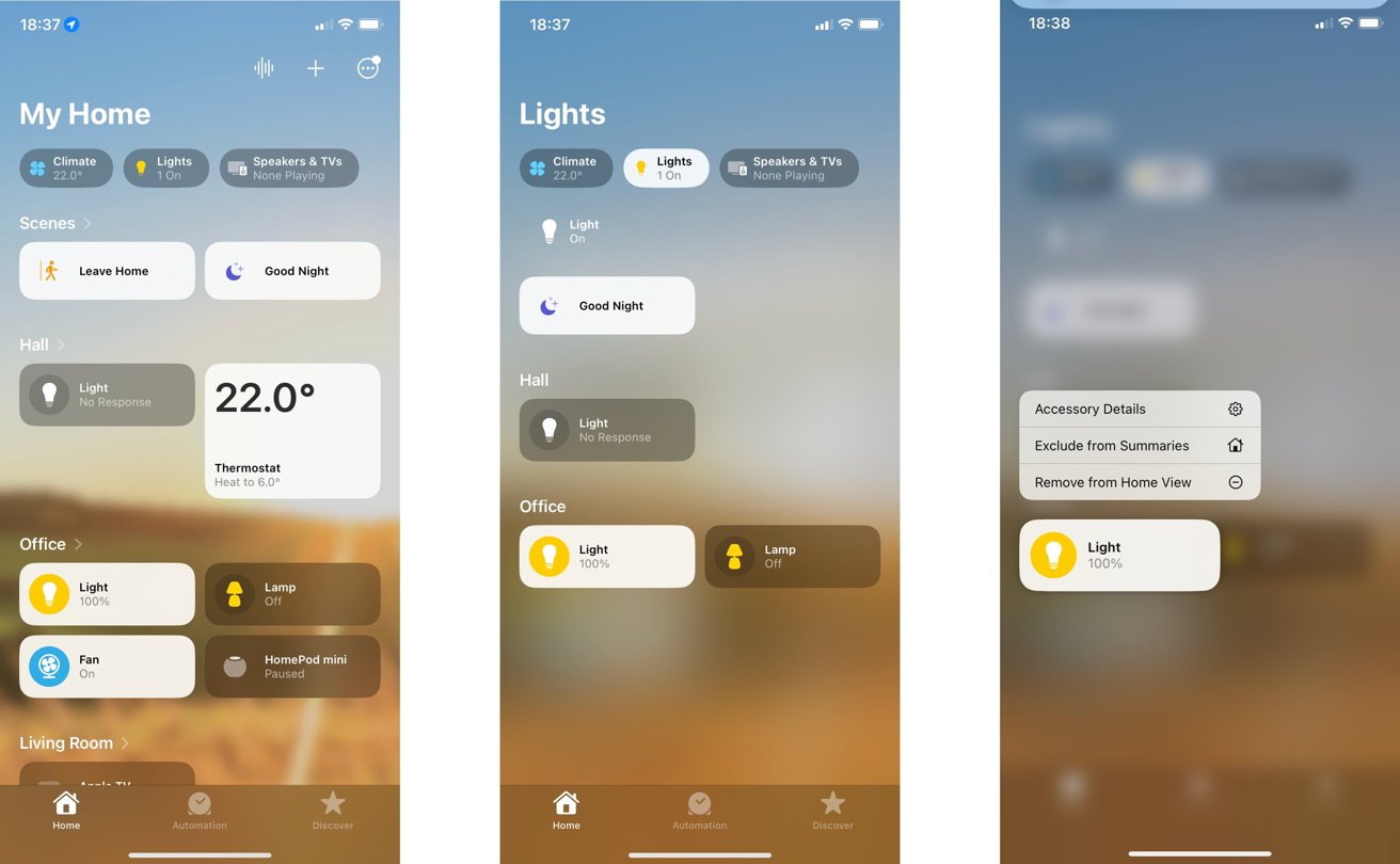
To go with the new Lock Screen, there are a bunch of new widgets you can add, providing more direct control of select accessories without fully unlocking the iPhone, nor navigating to either the Home app nor Control Center.
These are all nice changes for right now, but the inbound Matter support will be a much more welcome change to the platform.
Health and Fitness
Apple's concern over the health of its users turns to the pharmacy for 2022. A lot of the Health changes center around medications that users may need to take.
Chief among the changes is the ability to create a list of medications, along with the ability to create a reminder to take them. This includes custom schedules per medication, as well as logging when you take them.
Adding medications could be done quickly using the iPhone camera by snapping a picture of the label, with all of the relevant information filled out for the user. However, so far, this doesn't appear to be operational.
This massive change could heavily benefit those who have trouble taking medications on time. Loved ones may feel more at ease that the iPhone is handling duties to nag people into taking the correct doses on time.
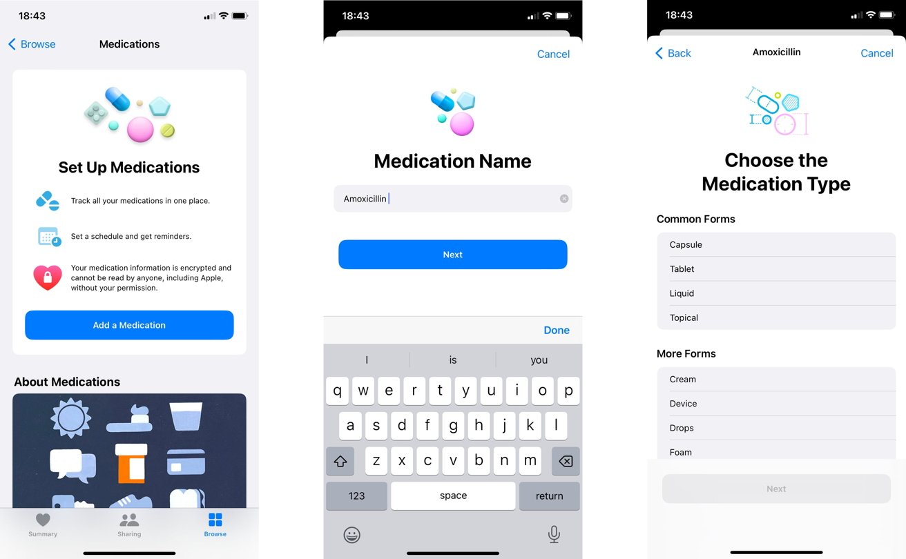
Health Sharing invitations can also provide extra peace of mind, enabling family members to receive health data collected on the iPhone. Naturally, the data that can be shared can be managed by the user, so they can at least maintain some privacy and dignity without revealing all of their health data points.
While physicians may know a lot about medications, Apple also warns users about things the doctors may not advise patients. Since some medications could cause others to become less effective or induce side effects, iOS 16 will provide an alert if there's a potential clash, hopefully prompting the user to make further checks before taking their medicine.
Educational content on medication is also available to users, so they can better learn about what they're taking. This information, which includes its uses and side effects, could be invaluable to someone wanting to take better care of their body.
On the Fitness side, Apple is giving iPhone users more of the potential benefits of the Apple Watch without necessarily needing the wearable device.
You may not necessarily have the Apple Watch on hand to do step counting, measure how far you've traveled, or for monitoring workouts using third-party apps, but you can with an iPhone's sensors. This includes an estimated calorie burn, which could easily contribute to the user's daily Move ring if their Apple Watch is on charge, for instance.
It certainly is helpful as a temporary stop-gap for Apple Watch-less owners, but it may push those who take note of the tracking to buy their own timepiece.
Accessibility
As usual, Apple's accessibility improvements in the latest iOS release are high in number and utility. The biggest thing to be brought up in news stories so far is the Door Detection mode of Magnifier, which can help people get in and out of rooms, but the rest of the changes are also pretty neat.
For example, the beta of Live Captions lets users see automatically generated audio and video transcriptions, and conversations, too, in real time. This even works with FaceTime, with speaker attribution to help with group conversations.
Then you have the subject of remote control, in two ways.
For gamers, there's the Buddy Controller, a feature that combines the inputs of two game controllers into one. This has its uses, such as assisting a person with reduced motor control play a game at difficult parts, though you could just as easily use it to help younger gamers.
There's also Apple Watch mirroring, namely the Apple Watch screen shown on the iPhone. This grants complete control over the smaller display on the wearable device, making it easier to manipulate and lets others perform actions or demonstrate features.
Since it's all done on the iPhone, you can use Voice Control, Switch Control, and other assistive features to manage the Apple Watch.
More on the audio side, you can now use Siri or Voice Control to cut phone and FaceTime calls by saying, "Hey Siri, hang up," for example. Though the other participant will hear the command, and there's the potential for it to be considered a verbal slamming of the handset in some situations, this may be useful for people in everyday life who have their hands full and can't manually tap a button.
Siri's accessibility changes also allows users to change settings, such as the pause time between a user speaking and when Siri responds to a request. You can also tell Siri to enable or turn off auto-answer for calls and to announce iPhone notifications via MFi hardware.
There are a lot of other extras here, including importing audiograms into Health, more customization of Sound Recognition, and a significant increase in language support for VoiceOver. All are adding to an already extensive number of ways Apple provides access to the iPhone to as many people as possible.
More smart stuff, and Siri too
There are other areas that we haven't touched upon in this review but will undoubtedly find an audience. This includes more local news and a customizable My Sports feed in News, Quick Notes on iPhone, Reminders alterations, an expanded Spotlight that now has a button on the home screen to access it quickly, and many others.
Sure, there's also the usual collection of language support updates for various bits of the operating system and even new elements for Memoji. Siri also gets the usual tune-up, with expanded offline support, emoji and better punctuation in texts, and ways to get up and running with Shortcuts and capabilities of new apps.
But we have to underscore that there are a lot of differences in iOS 16 to take in. Apple adds many features each time, and it should be no surprise that going through the entire lot is difficult for most users.
It's doubtful that anyone will find a use for every feature Apple includes, but a lot will be quickly adopted by users and become part of their everyday usage of their chosen smartphone.
A bit later than planned
As is typical for Apple's milestone operating system launches, not everything that Apple bills as a change will make it into the initial release. In some cases, you won't necessarily see Apple's announced changes until long into the future.
For example, Live Activities, which will show real-time updates for sports results, food orders, or other times, won't be shown from day one.
Then there's Matter support in HomeKit. Sure, it's pledged, but again you're not going to get the benefits of it fully working until later in 2022 at best.
Apple announced the Freeform app during WWDC 2022, an app to help users come up with creative ideas via mind-mapping and a large collaborative virtual workspace. That's not appeared in betas at all, but Apple insists it will be out eventually.
Apple also technically lists a new CarPlay experience as part of iOS 16. Its tease of increased integration with in-car systems and using more displays inside the car may be all well and good, but the first announcements from car producers adopting it won't be until late 2023, putting it in iOS 17 territory.
There's probably quite a few more things that won't make it to the deadline, such as the previously mentioned iCloud Shared Photo Library. The vast majority of functionality will be there, and you won't have that long to wait before most of everything else is implemented.
Not groundbreaking, but it doesn't need to be
Every year, the changes Apple introduces to iOS are looked at to determine whether it is worth the update for most users. It's a bit of a silly question, as most users who value their security and keep up with the latest features will upgrade to iOS 16 anyway.
It's better to look at the mass of updates and try to weigh whether Apple did a good job overall for 2022.
We certainly can't point to any single feature and say it is worth the update for that element alone. There's nothing that you would consider a massive milestone that makes it a must-have update for everyone, though some will have their favorites.
It's clear that iOS 16 builds upon a lot of the work that went into iOS 15 and all of the updates following the 2021 release. Much like the change from iOS 14 to iOS 15, iOS 16 isn't an overhaul to something brand new but rather a refinement of what's already there.
What Apple includes is a massive number of alterations that make most of what it offers even better. There's not really anything that could be considered a negative change to any one feature, unless you were really tied to the iOS 15 Home app's design.
The upgrade to iOS 16 is Apple honing the blade to make it even more helpful to its user. Apple didn't have to bring out anything new or radically make changes for the sake of change, as it didn't need to.
The release of iOS 16 does exactly what Apple intended: make what was already a great user experience even better.
iOS 16 Pros
- Customizable Lock Screen with widgets
- Overhaul of Focus
- Photo Lifting
- Family sharing and management
- Safety Check
iOS 16 Cons
- Highlight features to follow after launch
- The first iOS in a while to leave devices behind