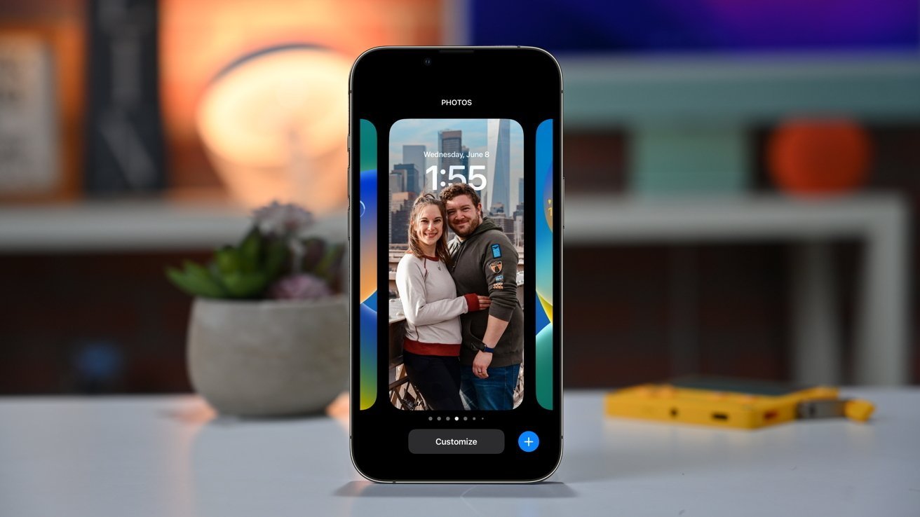
Apple's overhaul of the iOS 16 lock screen was an "act of love" to make the iPhone even more personal, according to Apple SVP of Software Engineering Craig Federighi.
Apple's introduction of an updated lock screen in iOS 16 provides a way for users to personalize their iPhone beyond selecting a wallpaper. Speaking after WWDC, Craig Federighi and Apple Design VP Alan Dye discussed the development of the lock screen changes.
"We knew this was a multi-act play, and we knew our next venue would be the Lock Screen," Federighi told TechRadar. "We saw a real opportunity to take that area that really has evolved slowly over time but has never seen this kind of massive step forward, and to do something really big — but something very Apple and very personal."
Federighi refers to it as being "an act of love this year."
Dye explained "Our goal was to make the iPhone even more personal - and definitely more useful - but also keep intact those key elements that make iPhone, iPhone."
He went on to say that the Design Team had a goal to "create something that felt almost more editorial, and to give the user the ability to create a Lock Screen that really ends up looking like a great magazine cover or film poster but doing it in a way that's hopefully really simple to create, very fun, and even with a lot of automation there."
Part of the magazine look is having elements intersecting with others, such as having the subject of the wallpaper appear in front of the clock. Dye says the segmentation is a years-long goal of the team, but had to wait until it was perfect as "unless the segmentation is just ridiculously good, it breaks the illusion."

Machine learning is also used to determine how to tweak a lock screen image to perfection. Federighi says there's "dozen neural networks that judge the photo based on whether it's a desirable subject, if there are people there, how they're framed and cropped in the photo, their expressions. All these things that allow us to surface automatically really great, compelling options for people and then to render them on the screen in a way that makes them feel almost all-new."
This information is used to provide users a selection of looks to choose from, rather than specific filters. According to Dye, if the system doesn't believe the image will look great, it simply won't offer it to the user, and instead choose something more appropriate.
"You get something so much more compelling than just laying a filter over the photo," Federighi adds.
The introduction of more items to the lock screen was certainly inspired by the Apple Watch complications, Dye adds, to make them as glanceable as possible. "There's no question - one of the benefits of having one design team that works on every product and the design across all of our products, we learned a lot about glanceable information and how to portray that over a variety of different images"
On notification changes, Dye offers the idea of them flowing in from the base of the screen is nice for personalization "because so often we see notifications completely obscuring the photo on your Lock Screen, which we didn't want to do with this new design."
With the influx of a new iOS version, the additional personalization options may be confusing to some users, but Federighi is confident it will be accepted by the public. Apple doesn't intend to force users into making major changes to their lock screen if they don't want to, and that it is a choice to engage.
"Somebody who would occasionally change the photo on their Lock Screen, they'd go into settings, and they'd go to that screen [that lets them make the change]," Federighi explains. "We meet them right there, as they go there and, some of this isn't in the seed build right now, but we make them aware of their option to either change what they have like they did in the past or to add another [lock screen]"