Here's how iOS user interface customization has evolved over the years, before "fresh apps" and new experiences are rumored to appear for customizers at WWDC 2022.
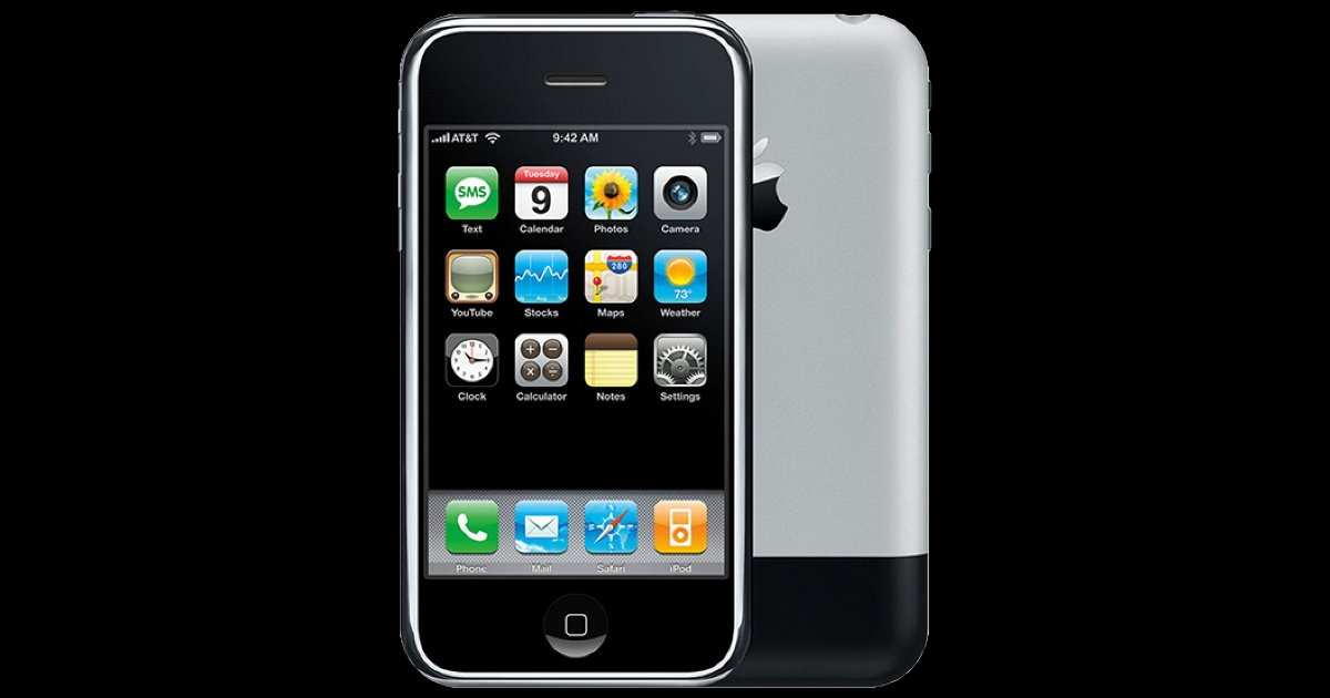
Apple customers have had some level of customization of the iPhone since the launch in 2007. The changes were limited to wallpapers, and fairly minor. But, it is also the first step to personalizing a device.
After the first version of iOS, the next piece of customization appeared in iOS 4. This update provided multitasking and the ability to sort apps into folders. Now people can easily go back to the previous app, or sort them into categories.
On May 7, 2012, iOS 5 brought the Notification Center to millions of iPhone owners. Finally, a way to keep track of app alerts from across the system. Users can tap on a notification to be brought directly into that app and take action.
Apple's release of the iPhone 6 in 2014 caused the iOS user interface to change. This iPhone gave customers a taller screen for an extra row for apps. The previous iPhone models were 4.5 inches tall and the display could be easily reached with a thumb.
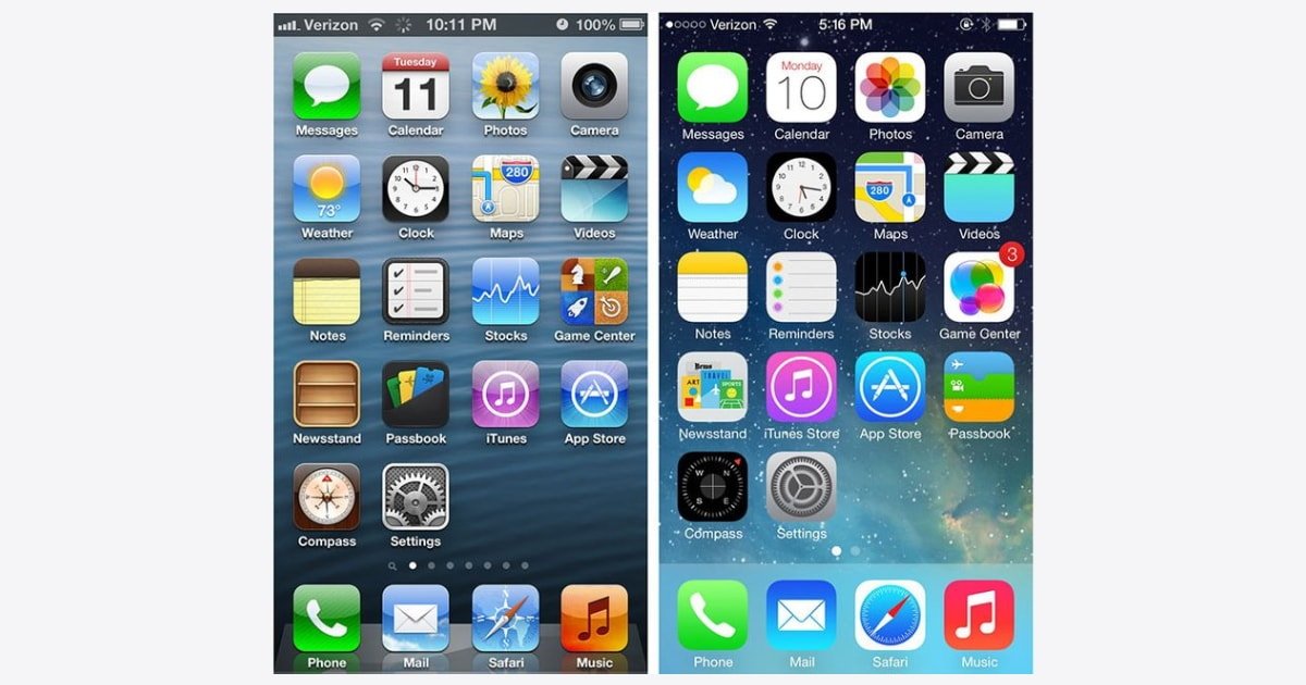
Next, iOS 7 was the first update to completely overhaul the user interface. Jony Ive took over iOS development and introduced the world to flat, minimalist design.
Before this, iOS embraced skeuomorphism with textures, stitching, glass, and 3D buttons and app icons. Scott Forstall, the previous head of iOS development, was in charge during this era.

Apple users got interactive widgets in iOS 8 that lived inside of the Today View. Apps could present actionable tasks for people to perform. This legacy system is still present as of iOS 15, but the new free-form widgets are the norm.
With the iPhone 6s and iOS 9 Apple introduced Live Wallpapers that people could set with the new 3D Touch, now known as Haptic Touch. At this point in time users also have the option to set moving Dynamic Wallpaper.
Live Wallpaper shows an object, such as a fish, animate for a second when a person pressed down on their Lock Screen. With Dynamic Wallpaper, a bunch of circles move in slow motion in the background.
The release of iOS 12 introduced the Shortcuts app and Siri-suggested shortcuts. This was a milestone for customization and unlocked new ways of interacting with an Apple device. Automation could turn routine tasks into time-saving actions.
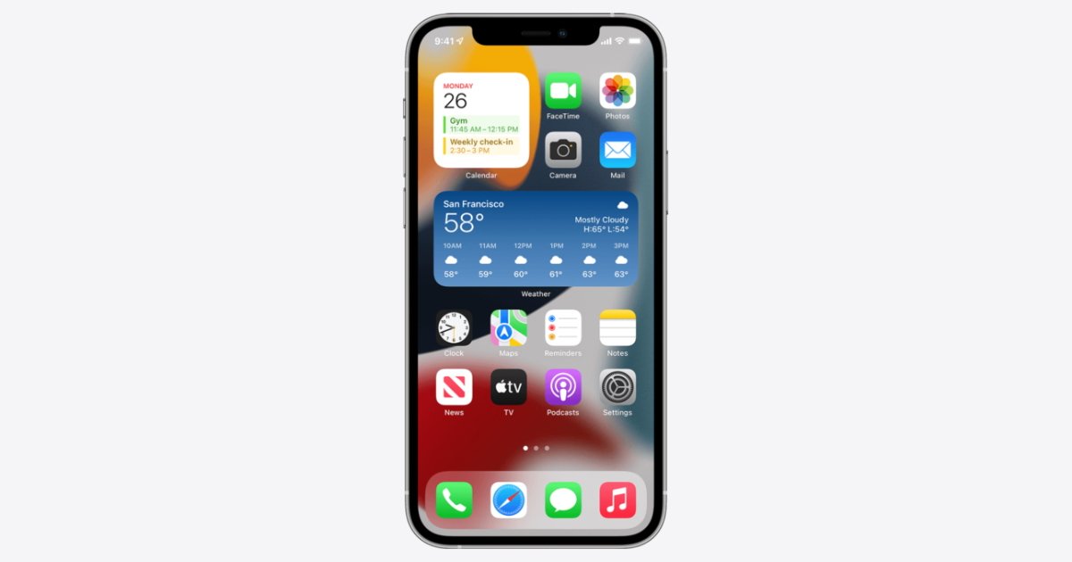
Apple borrowed several features from Android when iOS 14 was released. Widgets on the Home Screen provided app information at a glance, and the App Library automatically organizes your apps.
Custom app icons also let users personalize the Home Screen like never before. Icons could now be color-coordinated with wallpapers.

Widgets existed on the very first Android phone which launched in October 2008. This is even before Dashboard, a home for desktop widgets, launched with Mac OS X 10.7 Lion in 2011.
A developer can display various kinds of data on a widget, and a user can tap on one to go directly into the app. It's not possible yet for the new free-form widgets to be interactive, such as a user writing an Apple Note from the Notes widget. AppleInsider has a roundup of the best iPhone widget apps for the Home Screen.
Another feature that Android had first is the ability to set default apps. Apple users only recently got this feature with the release of iOS 14 and it is limited to mail and browsing apps.
In the current release of iOS 15, Apple lets people customize Safari. It's now easier to manage your browser tabs, and tab groups let you organize them.
When you open a new tab in Safari you can control which information is displayed on the Start Page. Privacy Report, Siri Suggestions, and more can be configured. You can set a wallpaper here as well.

What's Next
Rumors say that iOS 16 will look the same as its predecessor in terms of user interface. Supposedly, there will be new ways of interacting with the system, as well as widget-like wallpapers on the Lock Screen.
Some iPad users may even get what they've been asking for: freely-resizable windows as enjoyed by Mac owners. There will also be new accessibility features, one of which is the ability to mirror your Apple Watch display to your iPhone.
In terms of customization, one area for improvement could be default apps. You can choose a default app for email and web browsing. As an example, an expansion of categories so people can set defaults for notes, reminders, calendar, music, and others.
More options for Live and Dynamic Wallpapers would be another welcome update. Apple has removed old wallpapers throughout the years and others have been around for years.
The release of iOS 16 is sure to bring even more options for iPhone customization.