Apple changed several OS features ahead of their debut at WWDC 2024
Last updated
Apple previewed a multitude of OS features and AI-related improvements during WWDC that didn't quite align with leaks and rumors. Here's everything Apple changed along the way.
In the months leading up to WWDC, AppleInsider published a series of exclusive reports detailing the different features Apple was set to debut at the event. In speaking to people familiar with the matter, we obtained a large amount of information on then-unannounced operating system features.
Along the way, Apple changed some of the features we described. Some features were renamed, others had alterations to altering design elements, removed functionality, or elimination entirely.
It is impossible to know why some features were changed or removed. One plausible explanation is our initial information may have been outdated and obtained from people familiar with earlier internal builds of Apple's operating systems.
Altered Calculator app
Apple's new Calculator application, developed under the codename GreyParrot and revealed by AppleInsider back in April, has received some unusual changes on macOS.
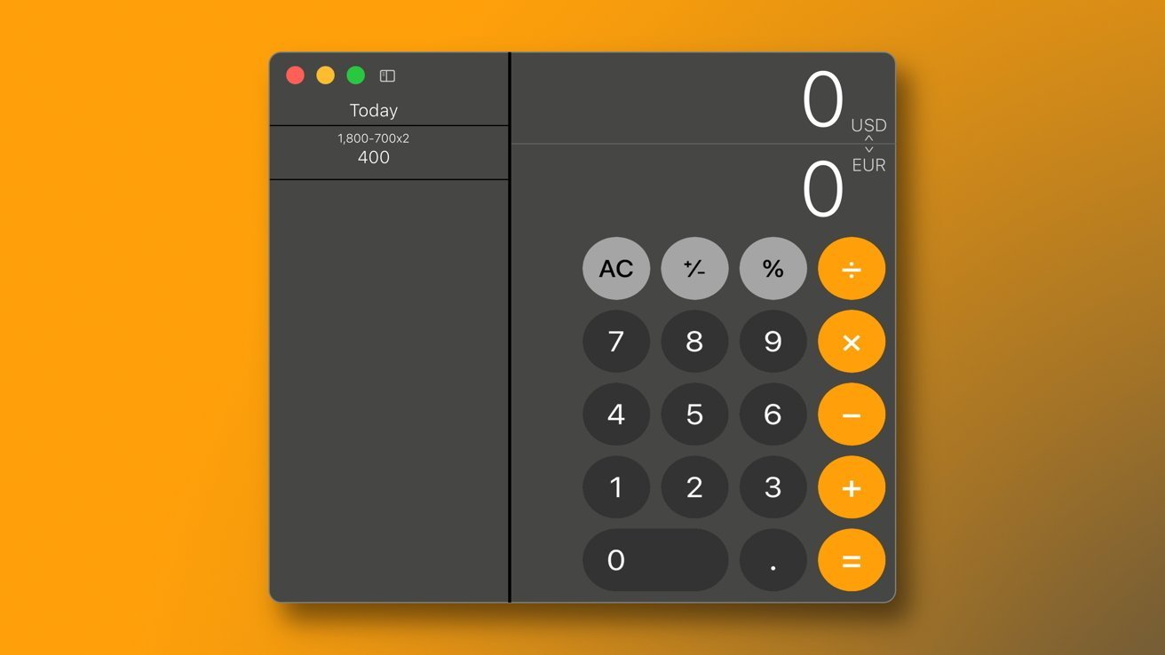
The core functionality and new features remain exactly the same as in pre-release versions of the app, as both Math Notes and the improved unit conversion system are present. That being said, however, the Calculator Apple shipped with macOS Sequoia beta is arguably worse than its internal development-era counterpart.
In the months leading up to WWDC, the Calculator app lost both its window resizing feature as well as the new history tape button on macOS. This means that it is no longer possible to resize the application window or activate the history tape without using the menu bar - even though both features were present in pre-release versions of macOS Sequoia.
Apple also made the Calculator application translucent, presumably as a way of distancing it from its iOS 18 and iPadOS 18 counterparts. It is not entirely clear why the company decided to go this route, as the GreyParrot project was conceived as a universal Calculator with a consistent look across all three platforms.
The tale of two Siri icons
In May, AppleInsider revealed that Apple was internally testing a new menu bar icon for Siri for macOS Sequoia, known then as project Glow. The discovered icon was monochromatic and replaced the previous colorful orb, allowing it to blend in with the other icons in the menu bar.
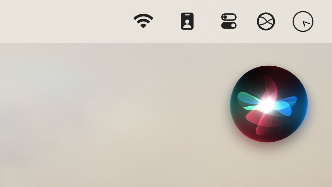
It appeared briefly at Apple's WWDC keynote on June 10, but only during one segment demonstrating the company's new iPhone mirroring feature for macOS. Throughout the majority of the keynote, macOS Sequoia was shown without a Siri menu bar icon.
Only towards the end of the keynote did we see a different, multi-colored icon with a new user interface for Siri on macOS. This icon was the one Apple ended up using for its developer betas of macOS Sequoia - though the new icon and new Siri UI are deliberately disabled by default.
Users of the social media platform X have found ways to activate Siri's redesigned user interface on both iOS 18 and macOS Sequoia beta. In the process, a pop-up message revealed that Apple considered the new Siri UI to be sensitive information and that it was not to be used "within 50 feet of undisclosed individuals."
It is possible that Apple removed the monochromatic menu bar icon for Siri on macOS Sequoia because a sensitive UI element was leaked. This is not the only possibility, though, as the icon could have been changed for any number of reasons.
As for the new monochromatic icon Apple created for Siri, it can still be seen in some of Apple's instructional videos as well. It appears as though the new multi-colored icon is meant to debut alongside Apple Intelligence, rather than the earlier monochromatic one.
Safari and Music missing features
Safari 18's Intelligent Search feature, which isolates useful webpage information and generates article summaries, was renamed to simply be called "Highlights." Earlier versions of this feature on macOS had iPadOS-like rounded buttons, but those are gone in the beta.
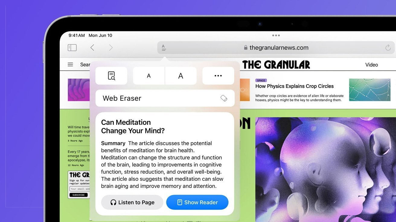
The most significant change made to Safari 18 was the complete removal of Apple's in-house content blocker, known as Web Eraser. With it, selecting and removing specific webpage elements, such as images, banner ads, text, or even entire page sections, was possible.
The Web Eraser feature may have been removed because of the massive controversy its reveal ultimately caused. Apple had received complaints from the UK's News Media Association and a group of French publishers about the unannounced feature, which we explained in our dedicated report on the feature's removal.
As AppleInsider revealed in an earlier report, pre-release versions of the Apple Music application featured an entirely new feature known as Smart Song Transitions. While this feature was in testing during the development of Apple's latest operating systems — iOS 18 and macOS 15 — it is not present in the publicly available developer betas.
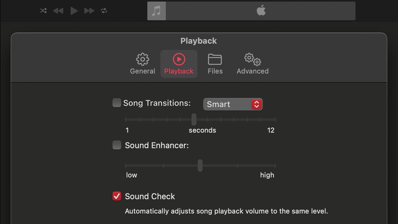
There are seemingly no references to this new feature within the systems themselves, and Apple may have removed it or delayed it to a subsequent OS update.
The feature could still make its debut later in 2024 when Apple Intelligence becomes available. Given the feature's name, Smart Song Transitions, it may utilize artificial intelligence to create an improved crossfade effect or another type of transition between songs.
What else did Apple modify during development?
Freeform Scenes, a feature initially revealed in a March report and later expanded upon by AppleInsider, has also received a similar change. Apple decided to give Scenes a recognizable star-type icon, replacing the sandwich-bar icon with three vertical lines used during development.
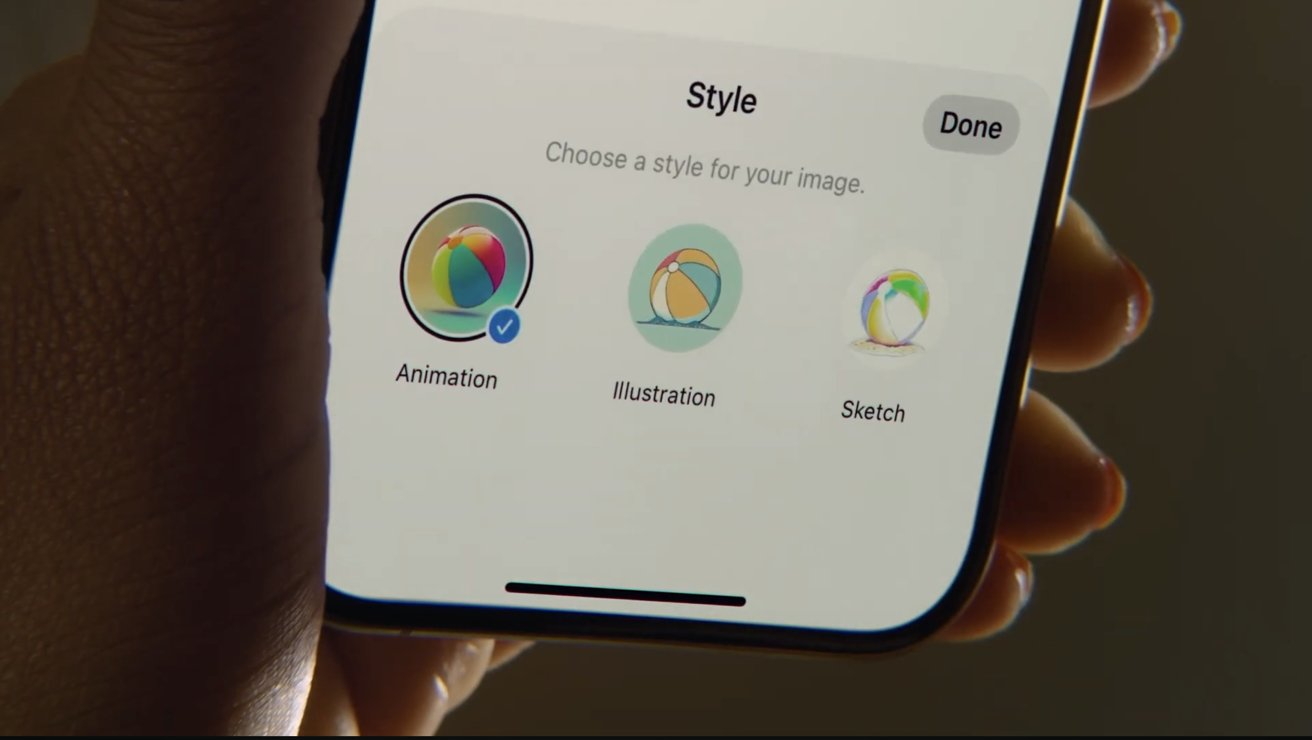
Several OS features received new names ahead of launch. Generative Playground received the name Image Playground. The name change was seemingly so rushed that Apple left the development-era name as the application title in its publicly available betas of macOS Sequoia.
Image Playground is an all-new system application that will let users generate images through Apple Intelligence on iOS 18, iPadOS 18, and macOS Sequoia. The application can create images in three distinct styles: Animation, Illustration, and Sketch, while a fourth style, dubbed Line Art, was scrapped ahead of release.
One of Apple's new accessibility features for 2024, originally known as Adaptive Voice Shortcuts, was given the new name Vocal Shortcuts. The company announced the feature ahead of WWDC, along with several other accessibility features.
Why does Apple sometimes make changes ahead of WWDC?
The company's in-development features and operating systems can change for a variety of different reasons. Sometimes, Apple isn't satisfied with the quality of a certain feature, or it takes more time than originally anticipated to complete it.

Sometimes, leaks can catch wind of features that may not see the light of day for years. Internal builds for iOS might contain features destined for multiple releases later, so it is pulled at the last second.
In 2020, an Internal UI development build of iOS 14 was leaked to a select few individuals, and eventually made its way to the press. Allegedly sourced from a development-fused iPhone 11 in China, the build contained references to a then-unreleased feature known as Wallpaper Collections.
Following the leak, the Wallpaper Collections feature was nowhere to be seen until two years later with iOS 16, when Apple finally announced it.
Apple also seemingly changed the name of its 2023 virtual reality headset and its associated operating system. Initially expected to debut as Reality Pro and xrOS, the company instead went on to announce the Apple Vision Pro and visionOS, respectively. Executives revealed that this was an intentional deception to keep the name hidden until launch, with only a handful of employees knowing the true name prior to launch.
Similar to the monochromatic Siri icon discussed earlier, clear mentions of the name xrOS could be found in the instructional videos Apple released following the WWDC 2023 keynote.
Whatever the reason, Apple's development process for new operating systems is long and complex. Leaks often come from snapshots in time that may represent old versions of concepts that have already been ditched. It's important to always approach leaks with some level of doubt.