Apple Upper East Side exterior
AppleInsider may earn an affiliate commission on purchases made through links on our site.
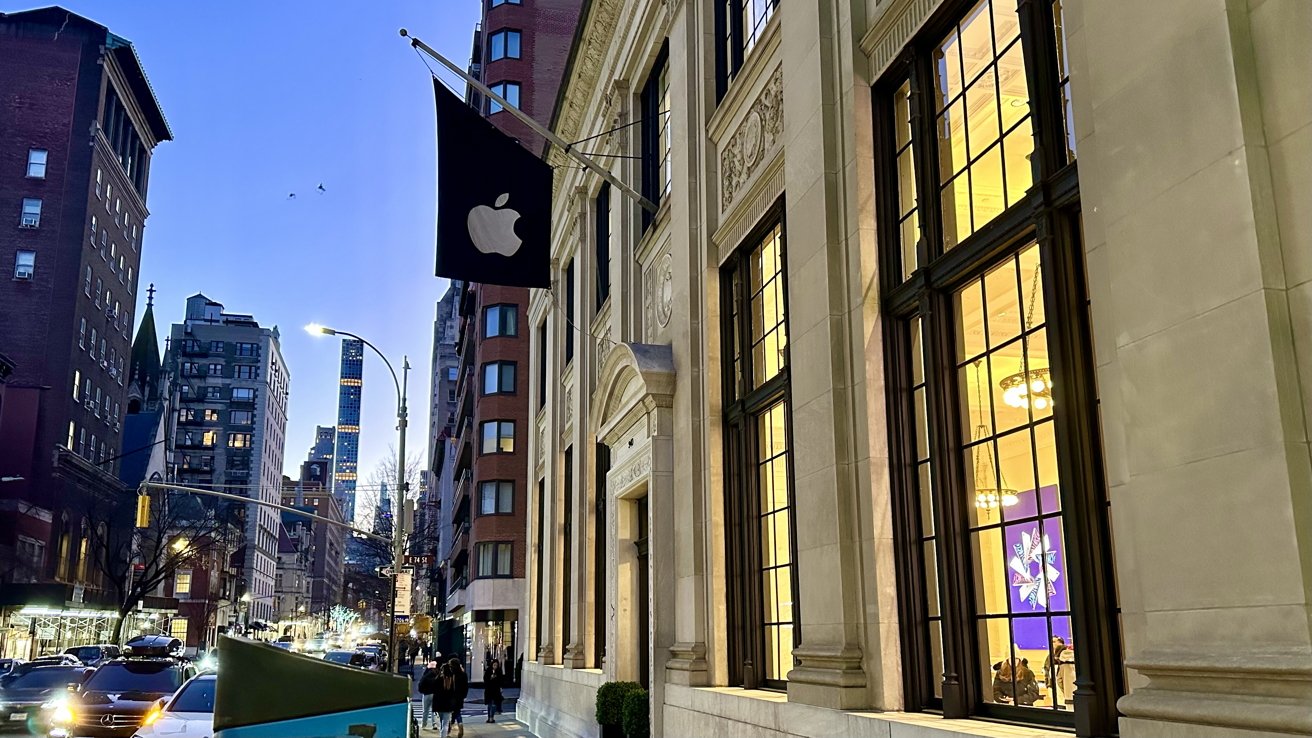
While the exterior — and interior — may look different than traditional Apple Stores you may have visited, Apple Upper East Side still offers the same Apple retail feel and experience people have come to know and love.
Apple Upper East Side was built on 940 Madison Ave in New York City, which was once the home of the United States Mortgage and Trust Bank and is located across the street from the former home of the Whitney Museum of American Art. While an Apple Store is located at that address now, Apple still maintained architecture to keep the bank's history alive.
The building offers a 95-foot storefront and 9,000 square feet of space. This room is believed to generate roughly $54 million per year for Apple.
When building the Apple Upper East Side store, Bohlin Cywinski Jackson — a well-known architect who has designed other famous and iconic Apple Stores, like Apple World Trade Center — and the consultant team wanted to offer a new shopping experience while keeping the same ambiance that was built in the exact location.
Keeping elements of the original building is normal, Angela Ahrendts, former senior vice president of Retail and Online Stores at Apple, once said when discussing Apple's store design. "It's no different than every customer downloads different apps and customizes their phones differently," she said.
Four principle components were upheld during the store's construction: preservation and restoration of the exterior, reconstruction of historic finishes, sensitive alterations, including creating new spaces in the cellar to complete the retail experience and support store operations, and substantial upgrades to building services.
These principles were adopted in restoring the overall retail space through its expansive, grand, and airy qualities and the reconstructed finishes and fixtures.
Due to the age of the Mortgage and Trust Bank, portions of the Indiana Limestone and Tennessee Pink Marble had been degraded, and many windows needed significant reconstruction.
Apple wanted to continue the work of the original architect of the building, so they thoroughly analyzed and identified the original paint and grout color, which resulted in the exterior being restored to reflect the original design. Chandeliers, marble wainscoting, pilasters, and plaster capitals were also carefully constructed to retain the interior architecture.
To show the extent Apple was willing to take, they sourced Botticino marble from Italy to reconstruct the floor finishes, wainscoting, and pilasters.
The team designing Apple Upper East Side also collaborated with local artisans to get help with their expertise on the matter. The expert groups Apple worked with were Aurora Lampworks, EverGreene Architectural Arts, and Nine Stone Marble & Tile, Inc.
Aurora Lampworks performs restorations of historic lighting fixtures and converts international fixtures for use, EverGreene Architectural Arts focus on preserving historic buildings, artifacts, and works of art, and Nine Stone Marble & Tile, Inc specializes in exterior facades and interior settings. Altogether, these three groups helped Apple's plan of restoring the building to its original glory come to life.
One of the standout areas of the building is the grand bank vault located on the lower level. To preserve the continuing plan of keeping the architecture in place, Apple kept the vault and transformed it into a VIP showroom for people to try Apple products. Initially, it was for customers to try the Apple Watch Edition in 2015.
Apple Upper East Side officially opened in June of 2015 to the public, with eager employees awaiting customers to come in and shop — or look — around.
Inside Apple Upper East Side retail space
Walking through the professional-looking doors and into Apple Upper East Side, you may first notice how tall the walls are. Taller than most Apple Stores would contain — unless you visit the Apple Store in Birmingham, UK, which was also once a bank — the walls hold structure for the big-and-wide windows and grand promotional Apple product images.
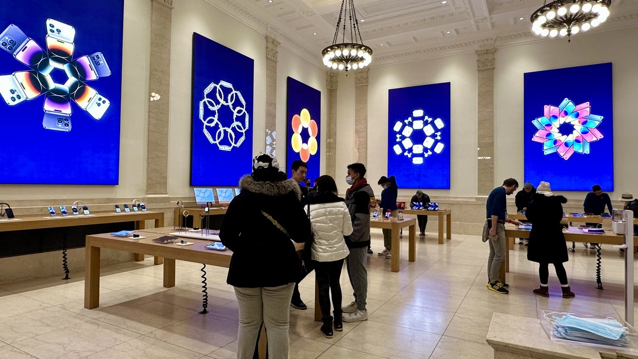
It's easy to tell that the building that Apple occupied was once a bank. From the walls to the ceiling to the floors, Apple Upper East Side ditches Apple's usual chromatic setting that their retail stores usually have and instead keeps the accents of the previous structure from the 1920s.
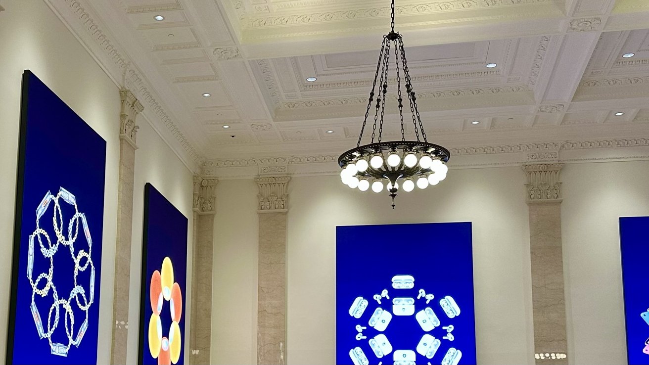
Scattered around the sales floor, you will find the usual wooden tables holding various Apple products for people to try. The layout is no different than a typical Apple Store, but the presence feels grander with the chandeliers dangling above you.
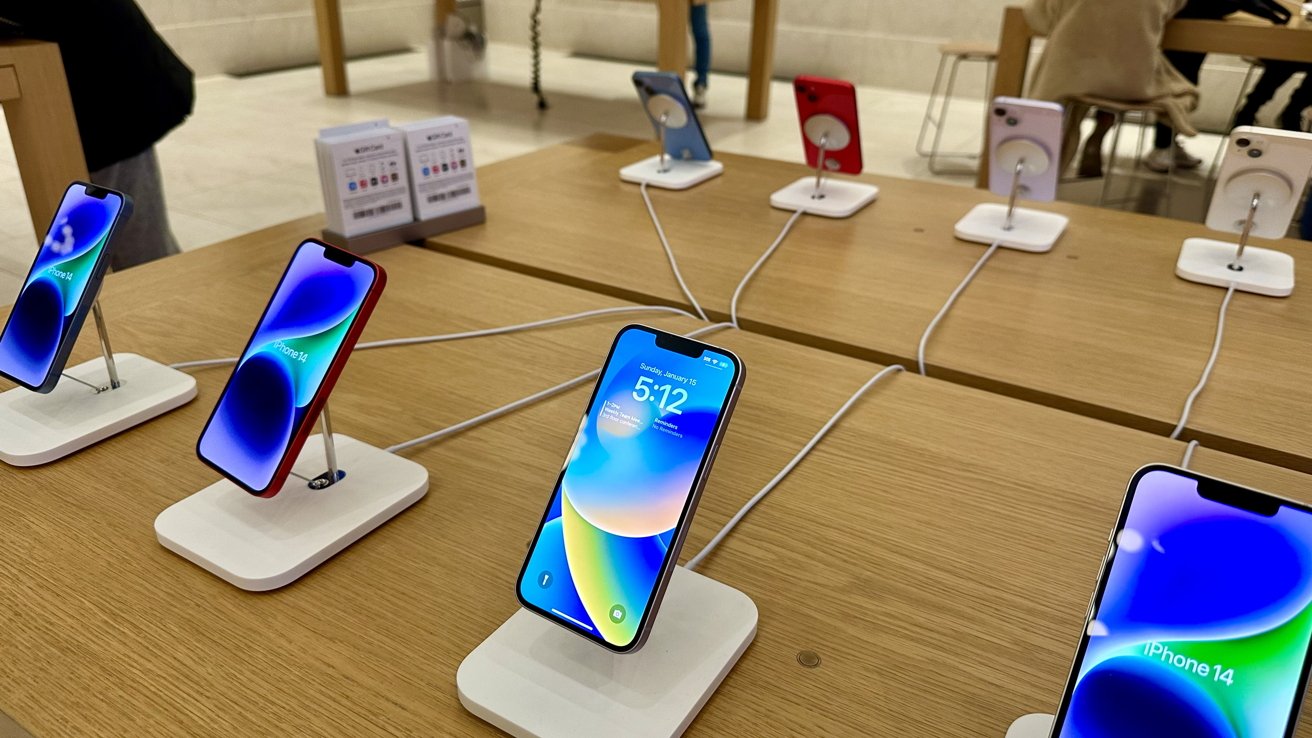
Along the back wall are iPhones and Macs to look at, and iPads and Apple Watches are located in the center of the store.
One seemingly missing element is the bookshelves showing off Apple's services and accessories. Apple may not have included them upstairs so they wouldn't block the interior design they worked so hard to preserve and continue to show off.
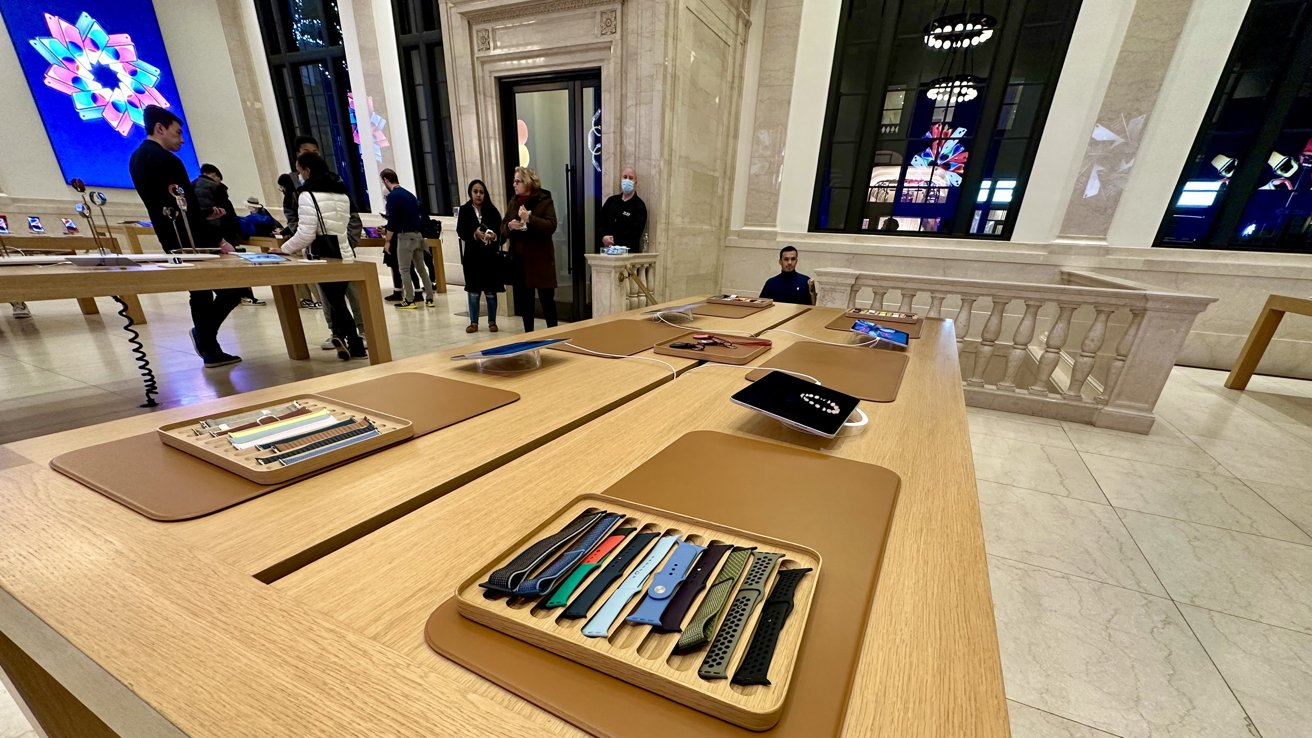
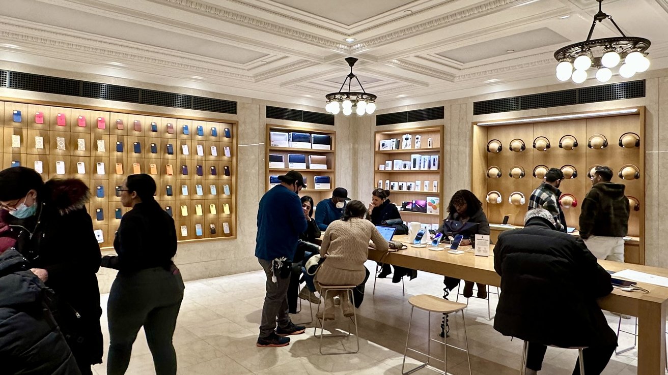
The section that may attract you is the marbled staircase leading to the Apple Store's lower level. Going down the stairs will lead you to another room showcasing Apple accessories — like AirPods and Apple Watch bands — and tables for customers to sit at when needing help from Apple retail employees.
The biggest attraction to the lower level would be the bank vault that Apple decided to keep when renovating the space for their new New York City store.
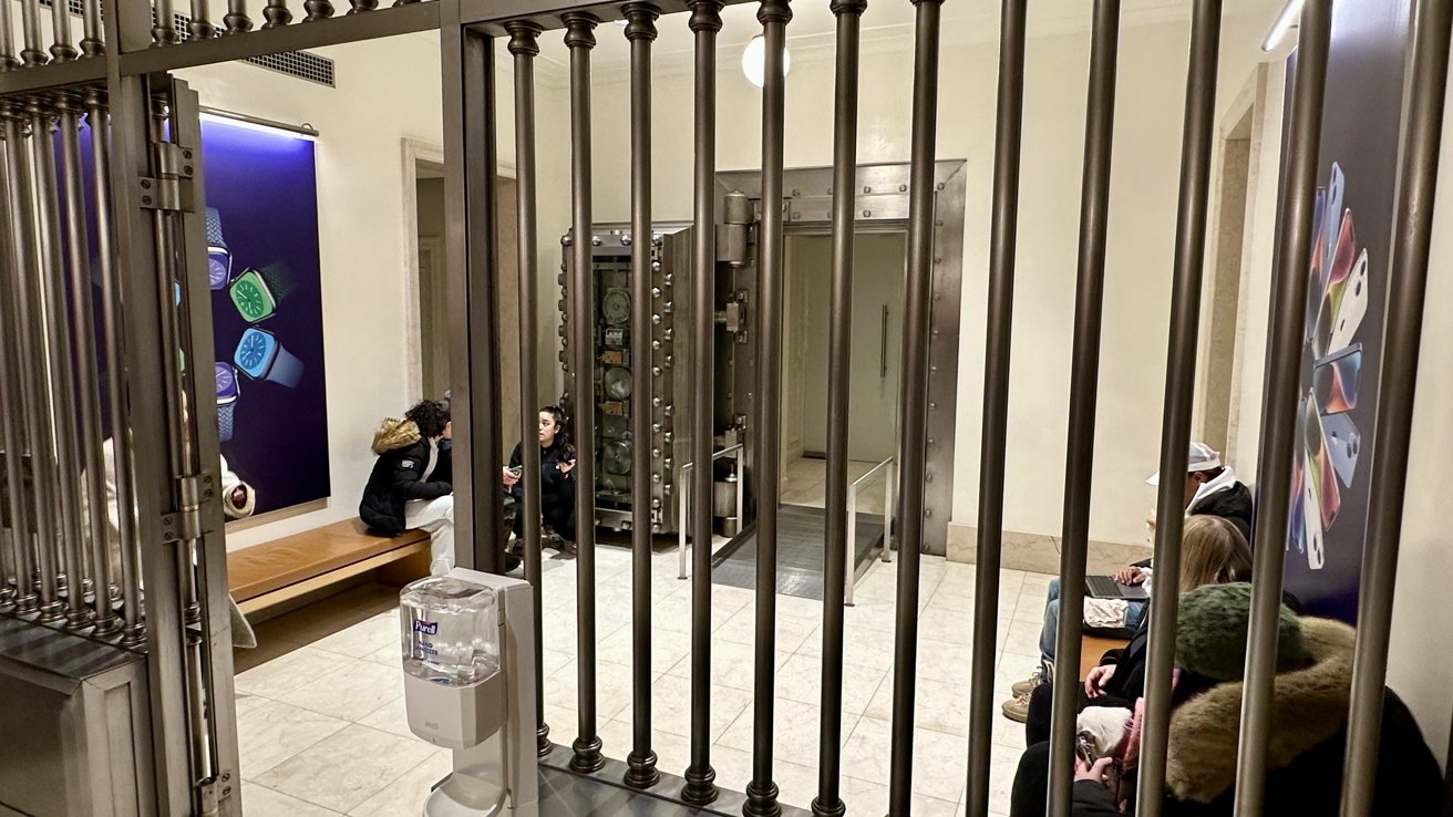
Behind the vault, cell-like bars are benches that people can use to rest or be assisted by store employees, and the area is surrounded by more promotional images of Apple's products hanging on the walls.
Further into the area, up the small ramp and behind the heavy open vault door, is a private area known as the Experience Room, for people to try out Apple products one-on-one with a Specialist. The room is decorated with signature Apple products against the back, a couch for people to sit on, and a big-screen television mounted on the wall.
When you're done with your visit, and go outside to continue your day, note the flag dancing above the entrance doors again. While many other Apple Stores in the United States display a big glowing Apple logo above their entrance, Apple Upper East Side shows off a single flag to mark Apple's retail territory on Madison Ave and to make it known that this old-fashioned building is indeed an official Apple Store.
Preserving historical architecture
Apple Upper East Side brings the Apple Store experience while delving into the architectural beauty once preserved and shined on Madison Ave. It brings the best of both worlds together, making them act in harmony rather than rivalry.
While other retailers might demolish the whole area and build from the ground up to remove nearly every aspect to create new space that fits their company design, Apple embraces unique architecture and finds a way to mold it into the Apple retail experience they give their customers. Apple Upper East Side embodies that and shows it from the inside and out.
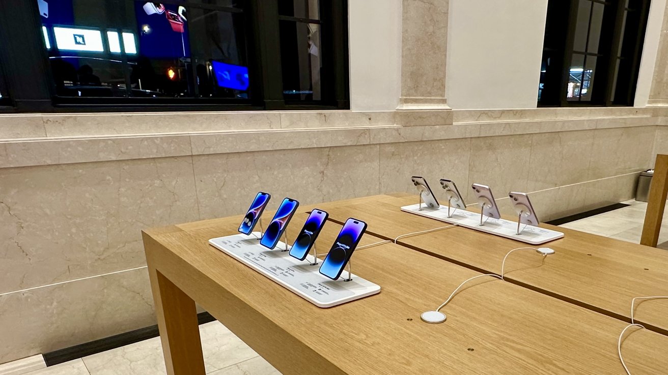
From the construction of the store to the running of it after officially opening to the public, Apple has shown that they are a company dedicated to keeping unique designs and is open to working with them instead of shunning them entirely.
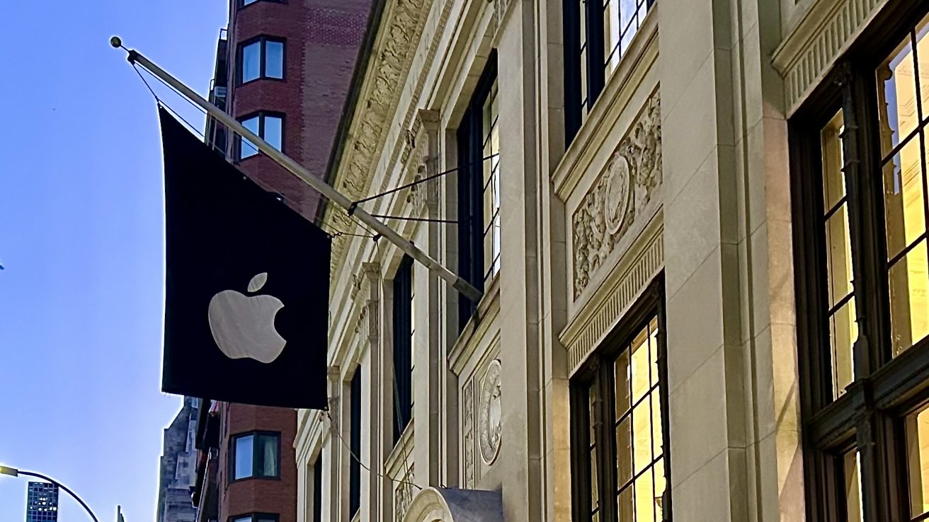
You can see this all from the marble flooring underneath you to the multiple chandeliers above you. With the Apple flag flying above, Apple Upper East Side marks its territory on Madison Ave. It attracts customers with its beautiful surrounding architecture and use of an old design that houses advanced technology.
For more examples of Apple Stores that preserve and incorporate historical architecture into their store design, check out Apple Grand Central Station in New York City, and Apple World Trade Center in New York City.