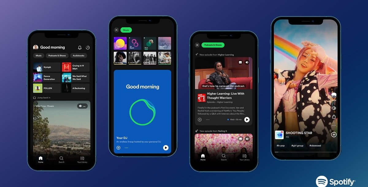
Spotify's new design

AppleInsider may earn an affiliate commission on purchases made through links on our site.
Spotify announced a redesign of its app recently with a new Home feed and automation features, and it may look familiar to some users.
The company unveiled the new design on Wednesday, calling it its most significant evolution yet. The company says that it was built to facilitate more meaningful interactions between fans and artists and deeper content discovery.
"The world today pulls us in a million different directions," said Co-President and Chief Product & Technology Officer Gustav Soderstrom. "So the most important thing we, at Spotify, can do for creators is to reduce the distance between their art and the people who love it...or who would love it as soon as they discovered it."
Styled similar to TikTok, and not that much different from Apple Music Connect, the new Home feed lets users swipe through video and audio previews for music, podcasts, and audiobooks and includes new video feeds for discovery in the Search section. Spotify also highlighted DJ, Smart Shuffle, and Autoplay for Podcasts.
DJ is a new personalized AI guide recently launched in beta for Premium users in the US and Canada. It learns from users' musical tastes to choose what to play for them.
Next, Smart Shuffle is a new experience to keep listening sessions "fresh" with personalized recommendations to match the sound of a user-created playlist. It can shuffle tracks and add new, tailored suggestions.
Finally, Spotify has added Autoplay for podcasts that can automatically play episodes from other podcasts similar to the previous one. The app is available to download for free from the App Store and requires iOS and iPadOS 14.0 or later, and tvOS 13.0 or later.