1Password released an early access version of 1Password 8 for iOS on Wednesday, which brings a redesigned interface and new backend to iPhone and iPad users. The new version of the app, which 1Password says will eventually make its way to all its supported platforms, has been available in early access mode for Mac since August, and was released for Windows in November.
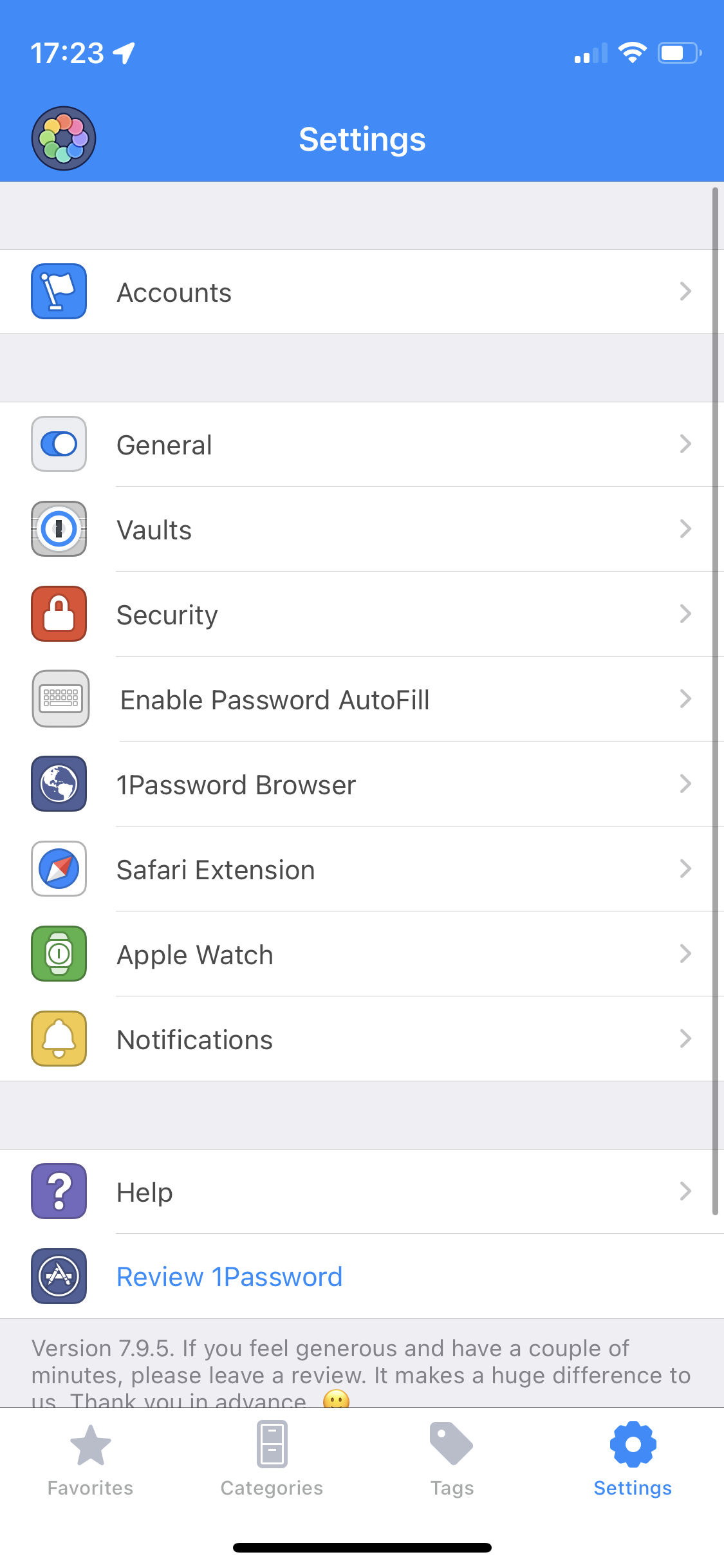
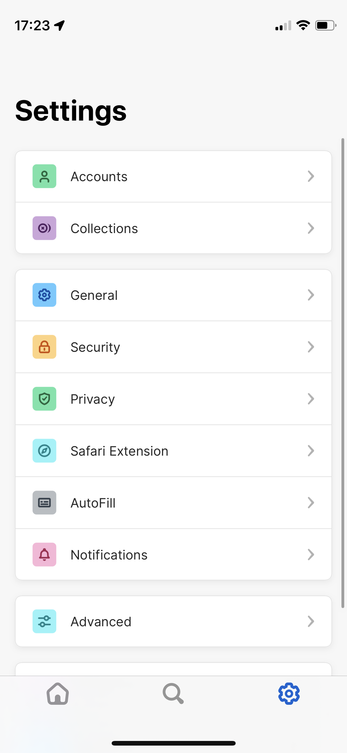
As a longtime user of 1Password 7, the redesign was immediately obvious when I opened the beta version of the app. As far as I can tell, almost every icon has been changed to be a little more fun and colorful, and the interface feels more modern now.


1Password 7 opened to a favorites screen with a few recently used passwords. Other than marking or unmarking logins as favorites, there wasn’t much you could do to customize the screen. This was always a little frustrating for me, because I basically never had any use for the screen, and would immediately bounce to search.
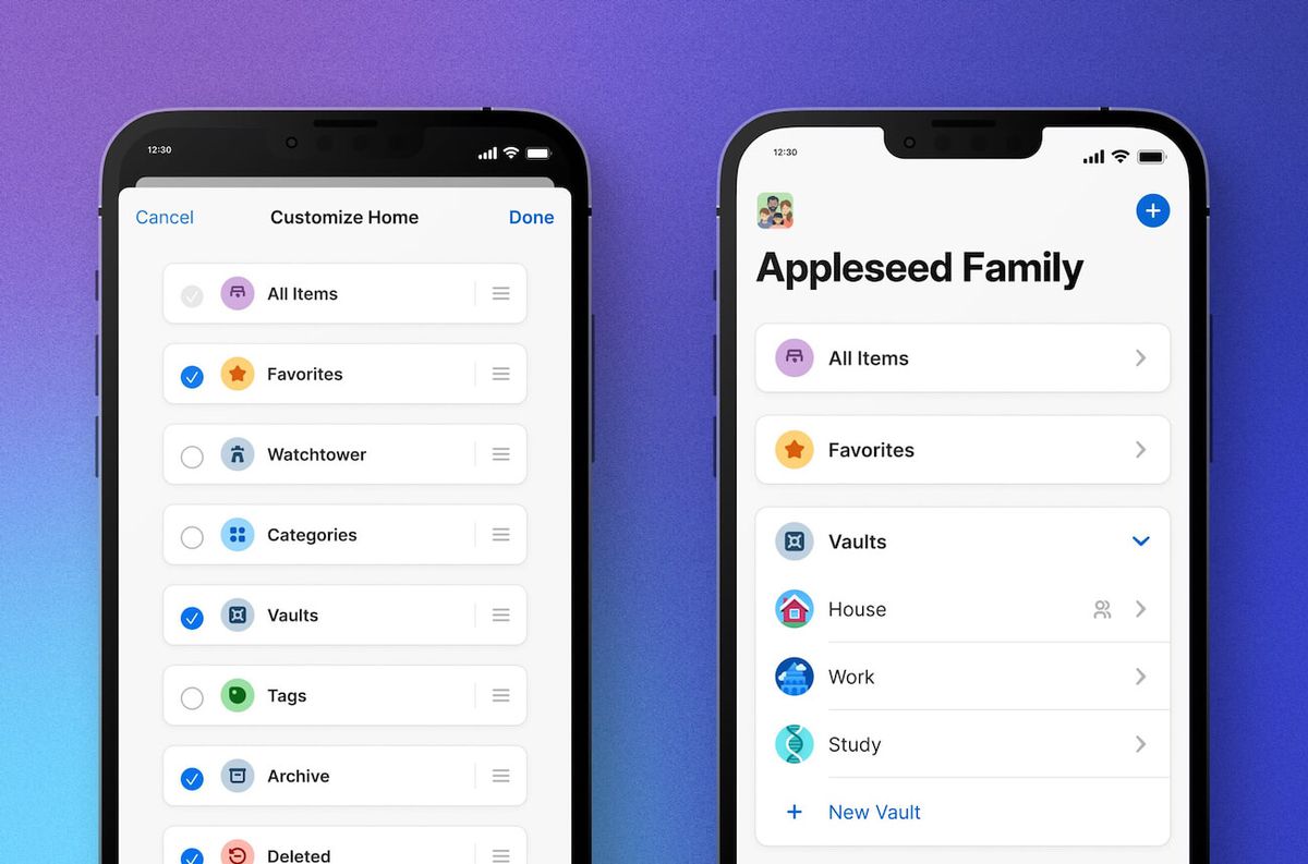
1Password 8, on the other hand, has a home screen that lets you access things like your vaults, categories, and lists of recently created or modified passwords. You can also change it to fit how you organize and access your passwords — if you’re a big user of categories, favorites, and tags, you can move those options to the top. If you dump everything into one folder, you can hide everything but “All Items”.

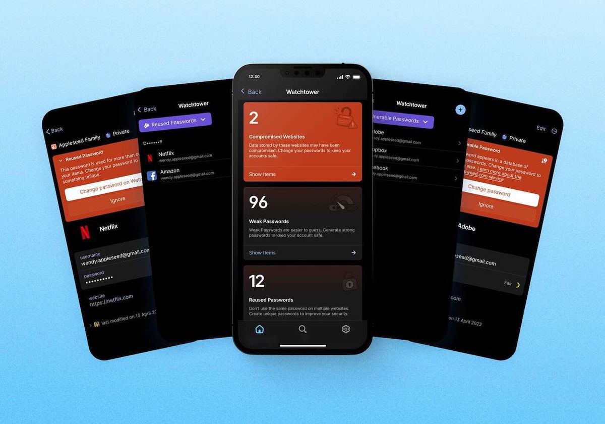
The old (well, current) version of the app would let you know if one of your passwords had been compromised, and could alert you if the login you were viewing had a reused password, but there wasn’t a single screen that let you manage your overall security. The new version of the iOS app adapts the desktop version’s Watchtower section for mobile, which also gives you an overall security score.

There’s been some controversy around 1Password 8, after the company announced that its Mac app’s user interface would be powered by Electron (the web browser tech behind apps like Slack, Evernote, and Discord) instead of native code like SwiftUI or AppKit. Some user s worried that the change would make the password manager more resource-intensive to run, or that it would feel less like a real Mac app. However you feel about that change, it’s not really a factor with this iOS app, which 1Password has said uses SwiftUI for the interface, and Rust for the core.
Of course, there are other reasons you may not want to use an early access version of a password manager. While it’s been okay for me so far, there will probably be a few bugs for testers to catch. If your phone’s password manager is absolutely critical to your work and / or life, it’s probably best to wait until an official release, especially since this update is a major change from the previous version. If you’re okay with increased odds of flakiness, though, and want to try the redesign for yourself as soon as possible, you can join the TestFlight using the link in 1Password’s blog post.